国民消费升级驱动商业场景迭代,擅以平衡手法重构空间的Towodesign堂晤设计,为上海中心地段新添了一处兼具复古氛围与当代元素的跨时空体验店。
With consumption upgrade in China driving iteration of commercial scenes, Towodesign, a Chinese design studio which excels at reorganizing spaces in a balanced and coordinated manner, created a unique experiential store that fuses retro atmosphere and contemporary elements in downtown Shanghai.

店铺位于魔都腹地南京西路,毗邻千年古刹静安寺。场地以原有的混凝土构造为基底,设计师加入定制化的金属道具,达到粗犷与精致的平衡。
The project is situated on Nanjing West Road, Shanghai, adjacent to Jing‘an Temple which boasts a history of more than a thousand years. The designers retained a large area of concrete floor in the original space, and added bespoke metal elements to the interior, with a view to striking a balance between roughness and exquisiteness.
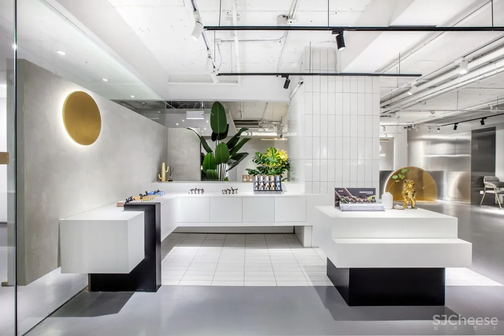
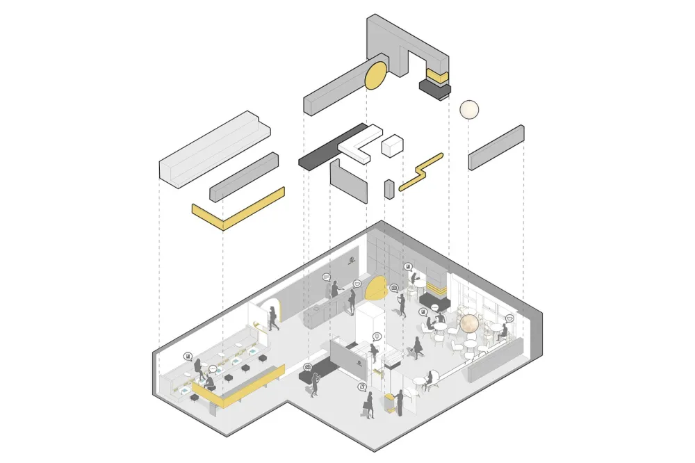
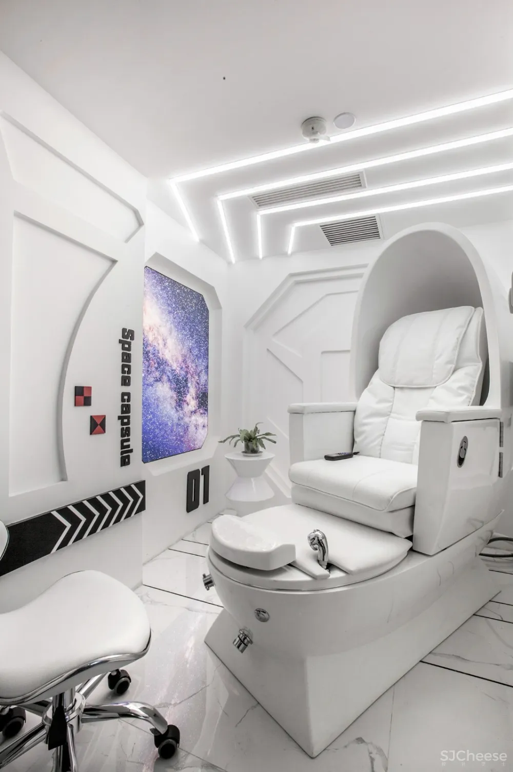
800平方米的面积容纳美甲、足浴、SPA在内的多种美业品类,并集结社交、休闲、娱乐等复合功能。不同主题和韵味的空间自由组合、相互穿插,人们穿梭其间犹如进入了时空隧道。
With an area nearly 800 square meters, the overall space contains various beauty service areas for manicure, foot bath and spa, etc., and integrates functions for socializing, recreation and entertainment. Interior spaces with different themes and charm extend and interweave with each other flexibly, seeming to bring consumers into a “space-time tunnel”.
起:去雕饰的裸妆精神I. Austere tone

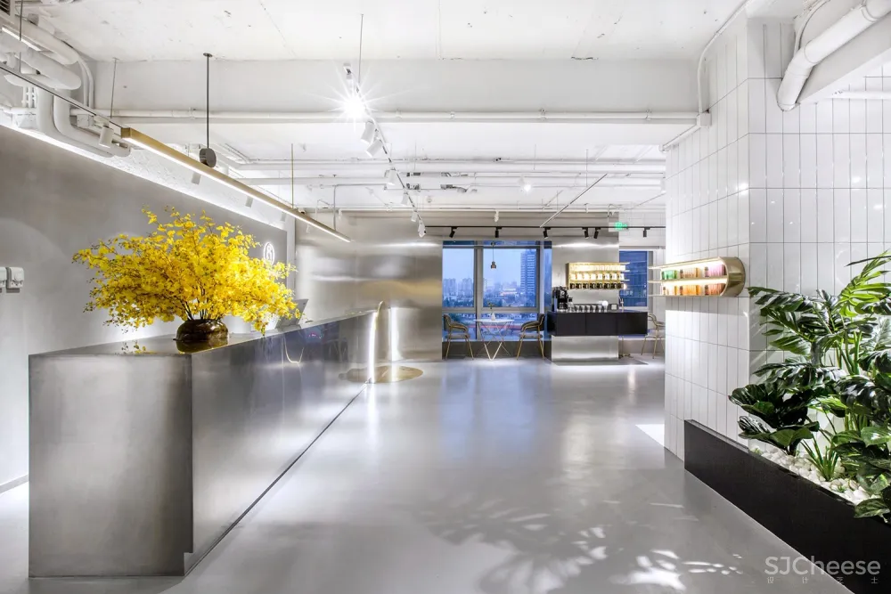
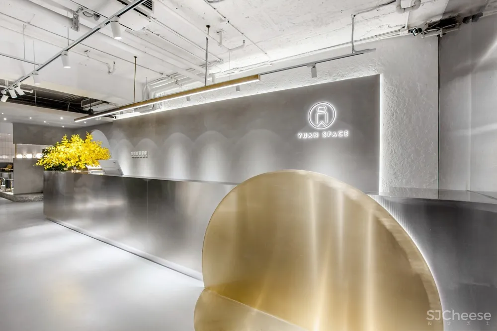
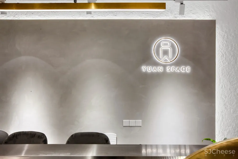
入口区以混凝土背景墙、水泥地面和金属质接待台铺垫工业风的基调。接待台的圆形装置和空间内分布的各种圆形元素呼应了品牌主题。因建筑层高仅2.7m,前厅天花未做吊顶,用裸露的水泥与管线作为朴实的顶部背景。
At the entrance area, the concrete backdrop wall, cement floor and metal reception desk together set an industrial tone. The round installation at the reception desk area and other round elements throughout the space echo the theme of the brand – “YUAN”, which means “round” in Chinese. Since the floor height is merely 2.7 meters, no decorations are added to the foyer’s ceiling, with exposed cement, pipes and wires producing austere visual impssions.
承:共享空间串联内与外II. Integration of inside and outside


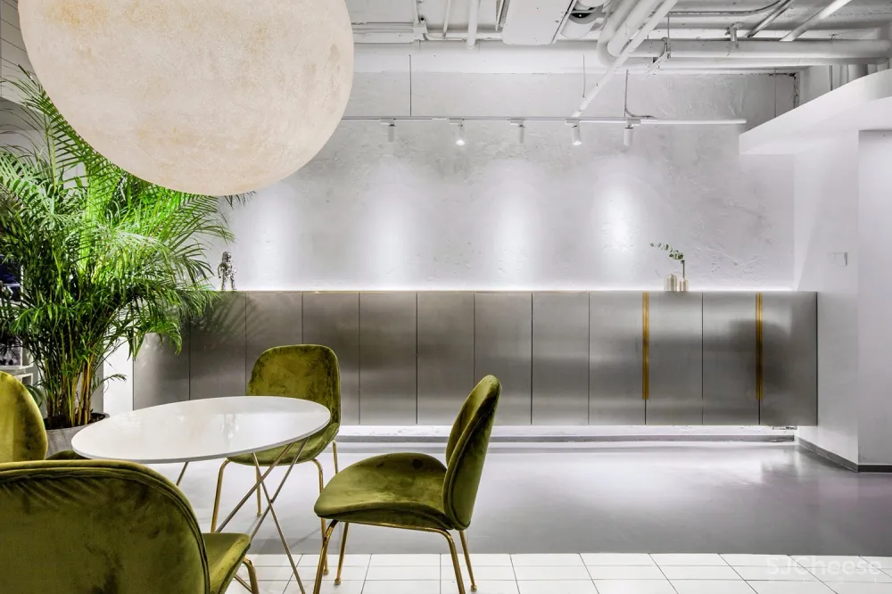
入口与收银区之间设置了开放式的休闲水吧区,作为顾客进入主体消费空间之前的过渡地带。大面积的玻璃窗将城市景观纳入视野,同时借景引光拉近人与自然的距离。
A leisure & bar area is set between the entrance and the cashier‘s area, which functions as a transitional space for customers to enter major consumption spaces. Large French window brings urban landscape and daylight in, thereby narrowing the distance between people and nature.

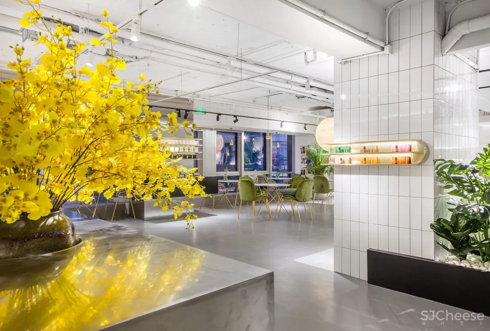
精简的形式和共享的功能有效消弭了心理上的陌生感,借以绿植的穿插更增强了空间亲和度。
This area’s simplistic design style and attribute of sharing effectively weakens the feeling of strangeness, and dotted green plants also makes the space more intimate.
转:围而不合的转角优化III. Smooth transition


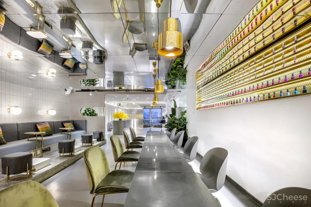

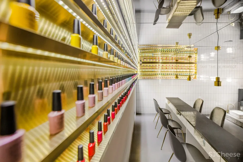
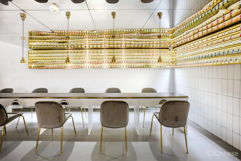

沿着行走动线的两翼,与水吧区相对而设的是公共美甲及美脚区。小片的白瓷砖由地面延伸至美甲台,充当隐性的导视功能,墙面的白瓷砖则自成一面简洁明亮的背景。抬高的水磨石平台划分出美脚区,功能分区明晰且留有通畅感。小白砖和水磨石作为经典复古元素也为时空穿越埋下了伏笔。
On the opposite side of the bar area are manicure area and pedicure area. Small pieces of white tiles extend from the floor to manicure desks, which guides customers‘ sight line and route implicitly. The wall clad in white tiles constitute a bright and clean backdrop. Besides, the elevated terrazzo platform demarcates pedicure area and manicure area clearly, whilst ensuring visual interaction. White tiles and terrazzo, as classic retro elements, set the stage for a time travel in the space.
合:古今交错的圆融之境IV. Fusion of the new and old
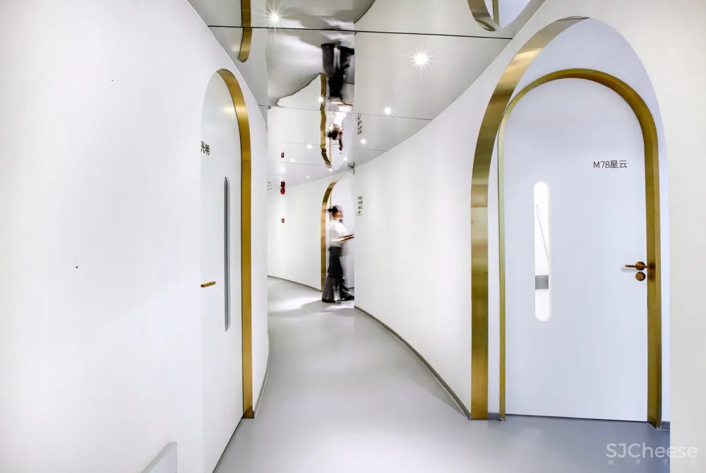
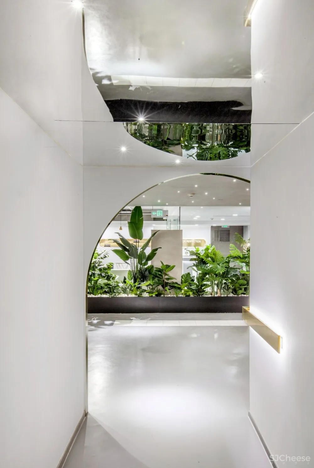


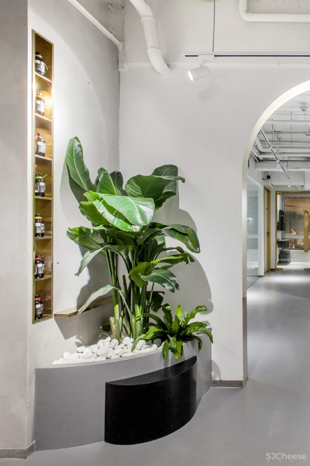

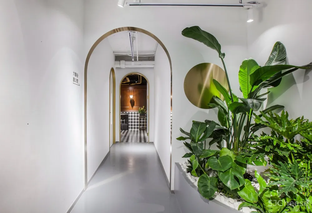
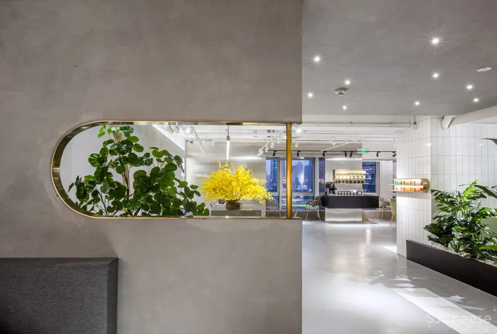
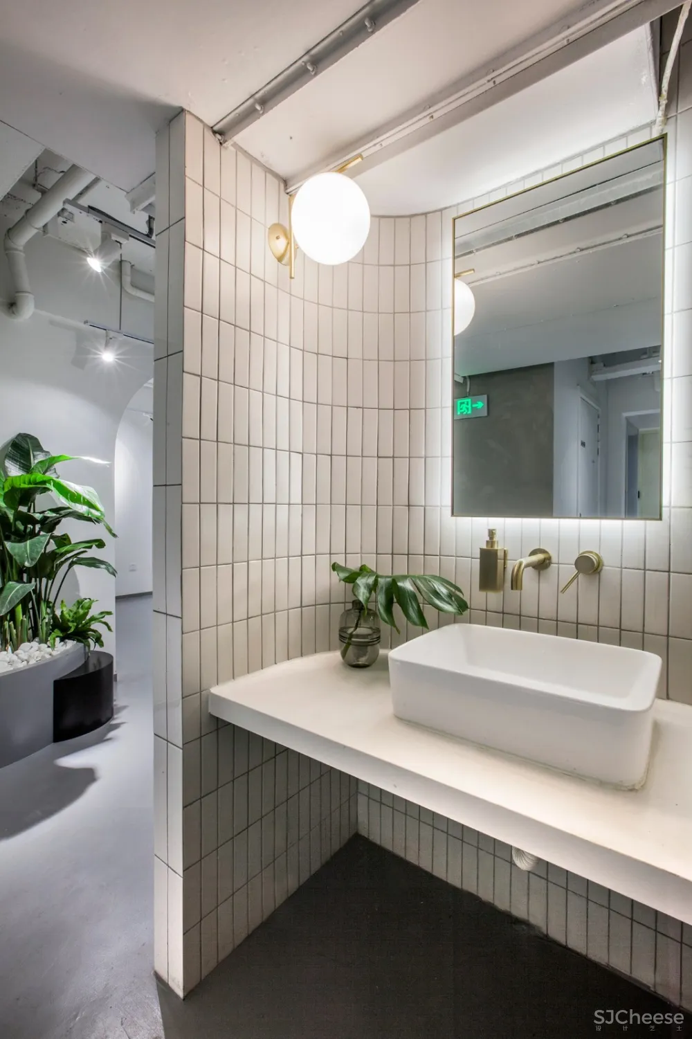
黄铜镶边的几何线条成为空间的主视觉,由嵌入式的产品展示柜放大至半弧形的门洞,叠加分布于弧线型的廊道动线上,镜面反射效果消匿了低矮天花的压抑感并延伸空间视觉。
Brass lines can be frequently seen within the space, from embedded product display shelves to the arched door openings along the corridor. The corridor features a curved circulation route and reflections by mirrors, which alleviates the oppssive feeling caused by the low ceiling and extends the space visually.
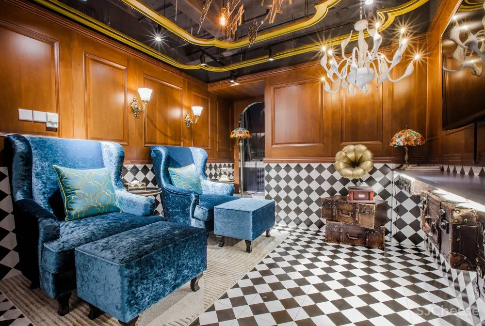
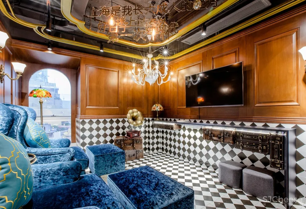


而在黑白方砖与深色实木围合的海派房间,克莱因蓝丝绒沙发、手摇电话和留声机诉说着十里洋场的往昔绮梦。
The room of old Shanghai style is finished with deep-colored wood and square black & white tiles, with Klein blue velvet sofas, hand-cranked telephone and gramophone producing an immersive and nostalgic scene.

项目信息——
项目名称:YUAN·Space
项目地点:上海市、南京西路1728号7楼
项目类型:美甲、SPA、足浴
项目面积:约800平方米
设计公司:Towodesign堂晤设计
主持设计师:何牧
设计团队:孙蒙、惠中旗、许晓瑜
完工时间:2019年3月
主要材料:金色拉丝不锈钢、水泥漆、白色条形砖、水磨石
摄影:Towodesign堂晤设计


