得益于更新的色彩和照明概念,Häuser der Mode 总部位于法兰克福/美因河畔埃施博恩 (Eschborn) 附近的现有建筑于 1972 年成立,经过创造性的重新思考和现代化改造。其结果是一个时尚中心,现在满足当代要求并在时尚买手行业中脱颖而出。
Thanks to a renewed color and lighting concept, the existing building of the headquarters of Häuser der Mode, located in Eschborn near Frankfurt/Main and established in 1972, was creatively rethought and modernized. The result is a fashion center that now meets contemporary requirements and distinguishes itself within the fashion buyer industry.
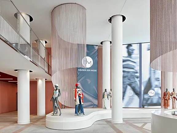
区域和国际层面的良好可达性赋予了时装屋其国际化的特征,现在已转化为其室内设计和外观。场地的现代化重点放在一楼的入口和流通区域。接待区将自己展示为 HdM 的旗舰,并沿着新合并的时装表演引导游客进入中央大厅。T台后面的大屏幕墙为品牌提供了展示自己的机会,也可以用作各种活动或赞助的广告空间。
Good accessibility on a regional and international level gives the fashion house its cosmopolitan character, which has now been translated into its interior design and outward appearance. The modernization of the premises has focused on the entrance and circulation areas on the ground floor. The reception area presents itself as a flagship for the HdM and guides visitors into the central lobby along the newly incorporated catwalk. The large screen wall behind the catwalk offers labels the opportunity to present themselves and can also be used as advertising space for various events or sponsorships.
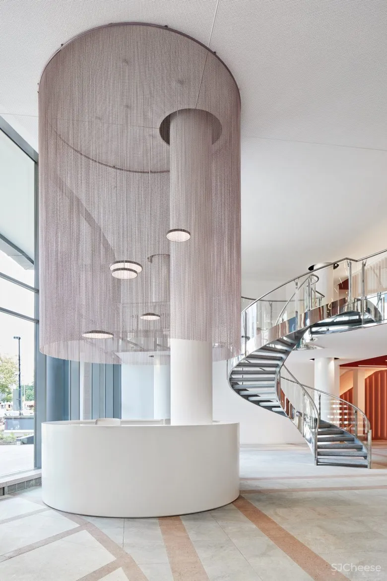
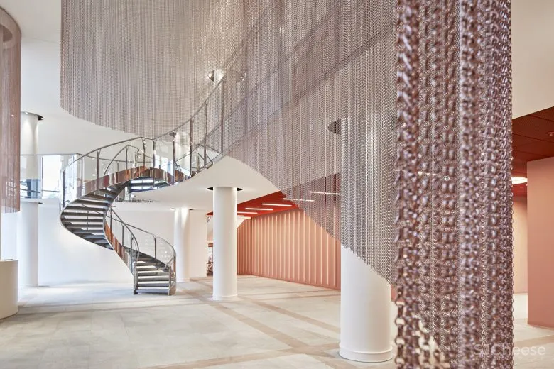
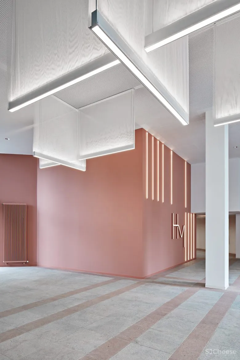
通过安装由铝网制成的优雅编织链帘,一楼的信息点与大堂在空间上分开。链式窗帘的动态安装创造了朝向大厅中心的运动。夹层中的新休息区可以直接看到时装秀和数字展示墙,使接待区变得圆润,吸引游客流连忘返。现有的抛光花岗岩地板经过灌木锤击和拉丝,以创造出哑光表面外观。以花岗岩地板为基础的玫瑰色调为新设计增添了色彩。
The info point on the ground floor was spatially separated from the lobby by installing an elegantly woven chain curtain made of aluminum mesh. The dynamic installation of the chain curtain creates movement towards the center of the lobby. The new lounge area in the mezzanine with a direct view of the catwalk and the digital presentation wall round off the reception area and invite visitors to linger. The existing polished granite floor was bush hammered and brushed to create a matte surface appearance. A rosé tone based on the granite floor sets the chromatic accent of the new design.
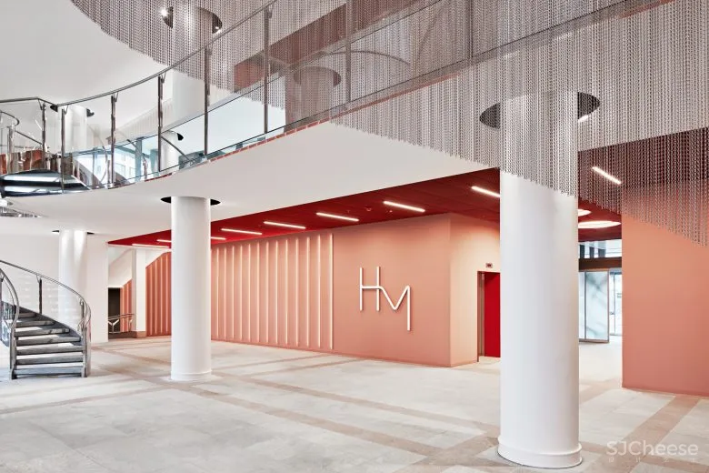
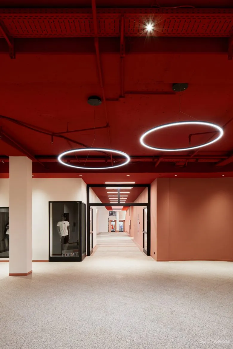
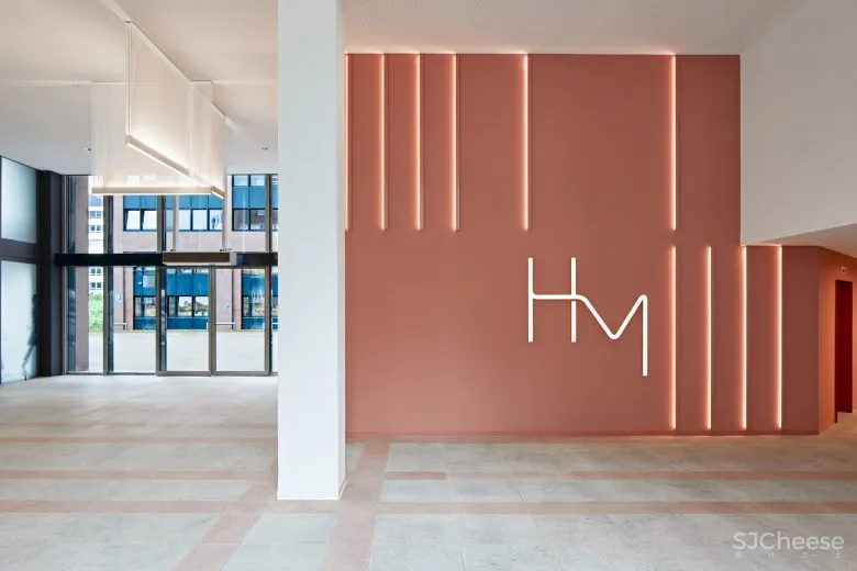
由于哑光饰面,花岗岩的红色调现在不那么强烈,是整个室内概念的中心主题。富有表现力的色彩概念也体现在 HdM 的新企业设计中。照明情况和新引导图形的金银丝设计完善了新的企业形象。这里的中心设计和概念元素是板条。
The red tone of the granite, which is now less intense due to the matte finish, is the central theme throughout the entire interior concept. The expressive color concept is also reflected in the new corporate design of the HdM. Lighting situations and the filigree design of the new guidance graphics complete the new corporate identity. A central design and conceptual element here are the slats.
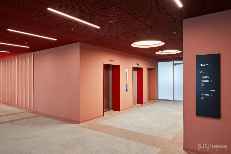
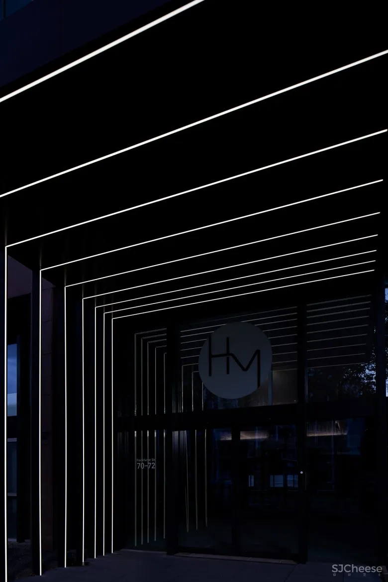
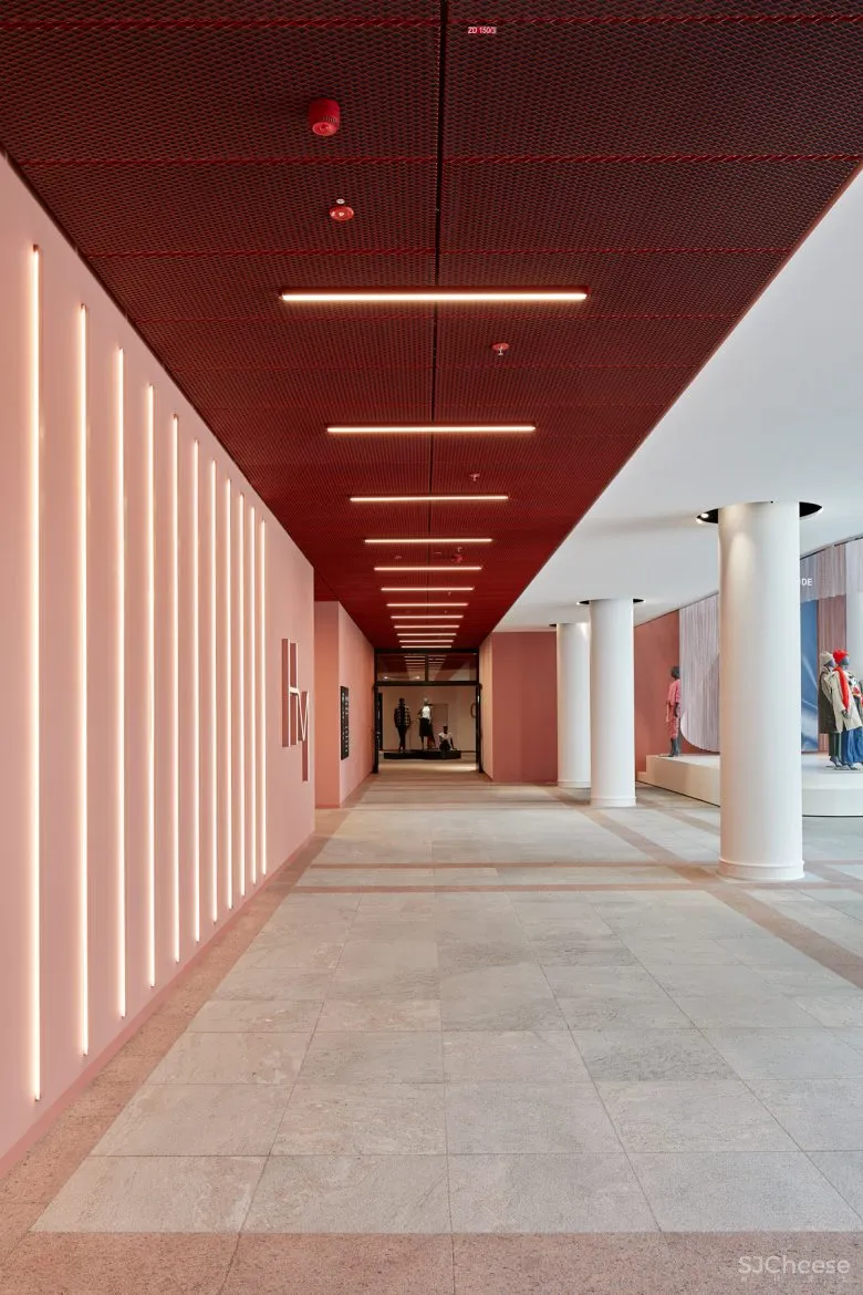
它们定义了从 4 号楼大厅到主入口和接待处的主要引导墙,并且可以在各个区域以寻路图形和访客信息的形式再次出现,这将支持识别价值和导向访客。除了在地下车库实施新的寻路系统外,还更新了电梯平台。清晰和开放的结构也体现在 4 号楼大厅的重新概念化中。随着二楼画廊的发展,创造了开放式工作空间和移动工作的可能性。
They define the main guiding walls that lead the way from the lobby in building 4 to the main entrance and reception and can be found again in various areas in the form of wayfinding graphics and visitor information, which will support the recognition value and the orientation of visitors. In addition to the implementation of the new wayfinding system in the underground garages, the lift landings were also renewed. The clear and open structures are also reflected in the reconceptualization of the lobby in House 4. With the development of the gallery on the second floor, possibilities for open workspaces and mobile working have been created.
画廊旁边的休息区还提供了在现场举行小型非正式会议的可能性。该区域可以被卖家用作商店空间外的退出工作区,也可以被顾客通过,并由单独的座位岛以及一个柜台形式的工作站完成,可以俯瞰整个店面。画廊。
A lounge area along the gallery also offers the possibility of holding smaller informal meetings on site. The area can be used by sellers as a drop-out workspace outside of the store space, as well as by customers passing through, and is completed by individual seating islands, as well as a workstation in the form of a counter, which overlooks the gallery.
室内设计:Just/Burgeff Architekten
建筑设计:Corinne Castagnotto、Gabriele Kaehlbrandt、Susan Kaiser、Marcus Kistner、Katrin Stöhr、Claudia Zimmermann
摄影:Kirsten Bucher


弧形空間的張力
好好看
有点海派摩登范?
好看
.