负片是经过曝光和显影加工后得到的影像,负片上的明暗关系与被摄物体正好相反。色彩与真实的颜色也是互补关系,实际红色在负片上成青色。早前,照片的底片就是以负片的形式得以保存。
Negative film is the name for a photographic film that will give images which have their colors inverted, after development. This inversion means that the complementary color is used, for example, if in reality the colour is red, it might appear to be cyan on the negative film. Roll film is being pserved in the form of negative film.
▼影院大堂一览,overall view of the cinema lobby
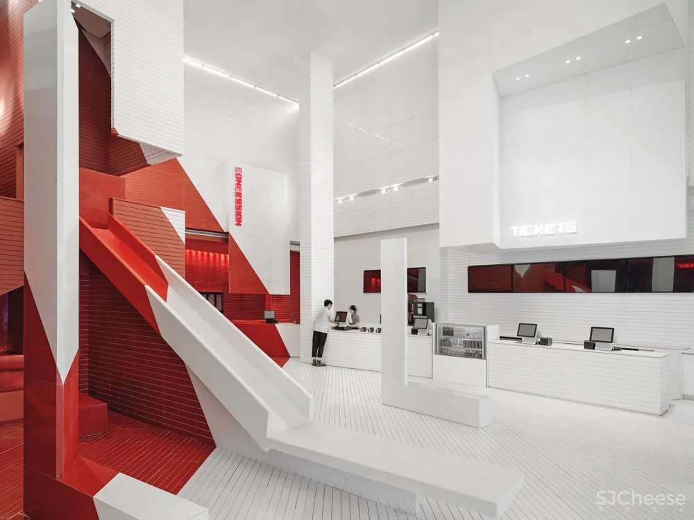
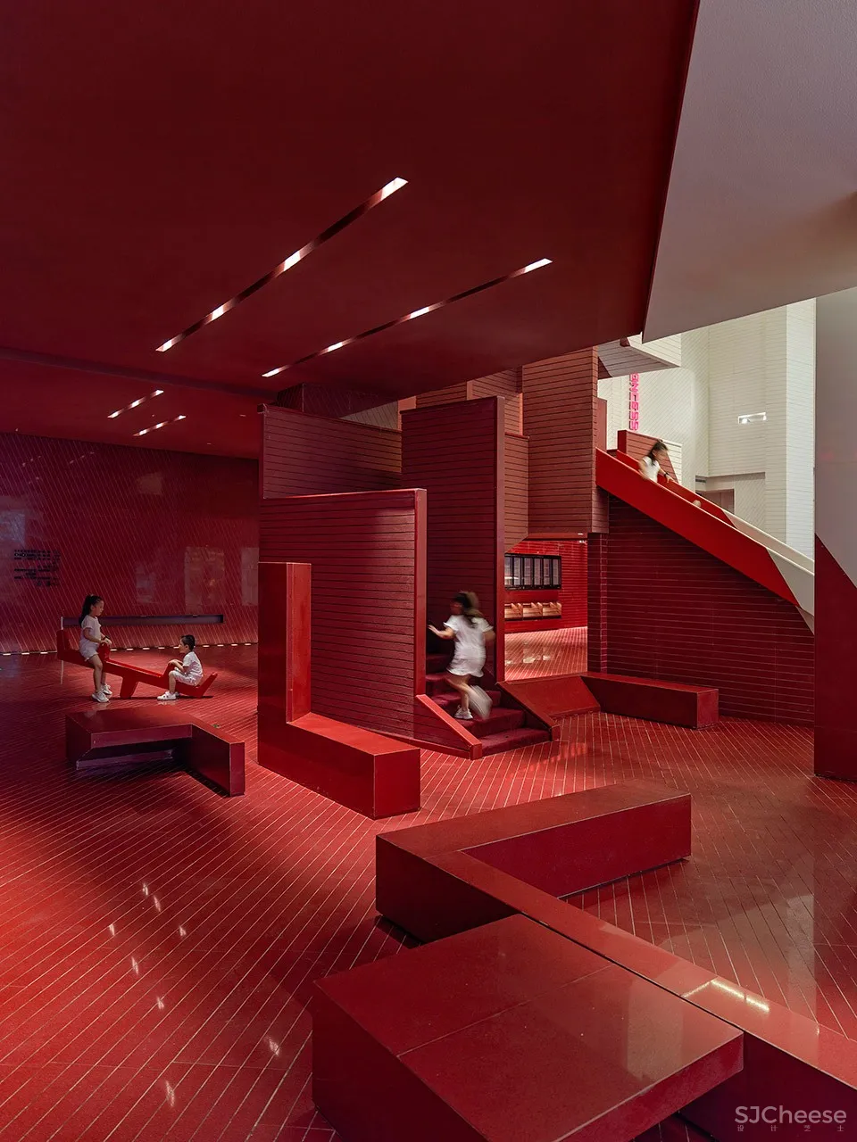
大堂最震撼的视觉效果是红、白分割的空间。空间中好像有一道看不见的光,将大堂分割成红色和白色两个空间,白色的石材从入口处向检票口延伸开去,碰撞到红色的石材之后,则整个空间瞬间变成夺目的红色。
The most striking visual effect in the lobby is the contrast between red and white colours. There seems to be an invisible light wall in the space. The whole lobby is divided into two spaces in red and white. The white marble extends from the entrance to the ticket gate. When it combines with the red stones, they work together to turn the whole space into a striking scene of red.
▼大堂由红白两色分割,the lobby is divided by red and white colors
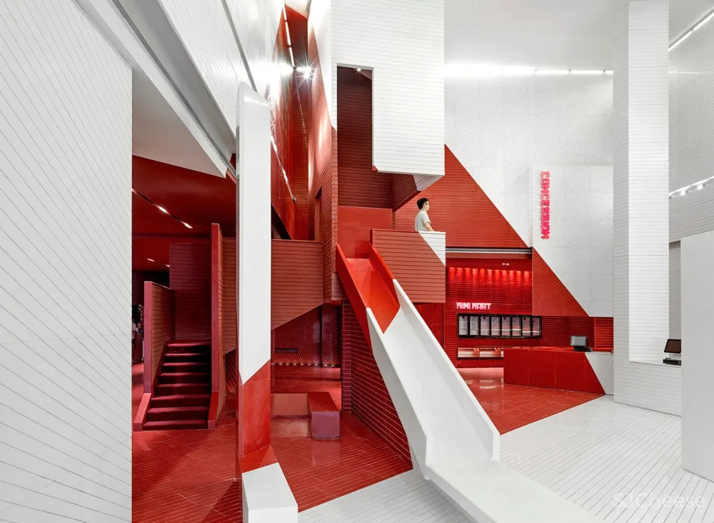
我们考虑到现在很多亲子,或者年轻人会结伴去看电影,他们都希望电影会给他们带去快乐的体验,于是在设计之初,我们考虑一些独特的游玩主题。我们在大堂设计了一部大型的滑梯,并且将滑梯的设计融入到整个设计概念之中,从红和白色的分割,以及造型的表现。我们希望给观众带去一种全新的娱乐感受和游乐氛围,区别与其它影院项目,即使并不是真的会去滑,而是看到这样一个设计,看人一看到就会觉得有趣,亦或者爬上滑梯,一滑而下,享受片刻的童真乐趣,也是给人带去欢乐的气氛。
The designers have also considered many families or youngsters would go to see the movies in groups. These audience groups are all expecting to be entertained by this movie viewing experience. This is the reason why the designers have thought about some individual game themes at the beginning of the design development. They added a huge slide in the lobby design and used it throughout the whole design concept – from the red and white distinction to the whole illustration of forms. They would like to give the audience new whole new entertainment feeling and playing vibe, so to stand out from other cinema projects. Even if the audience does not really play with the slide, they would immediately think it’s funny when seeing it. They can also really climb up and slide down to truly enjoy being a child again.
▼大堂中的设施带来游乐氛围
the facilities in the lobby bring an entertainment feeling
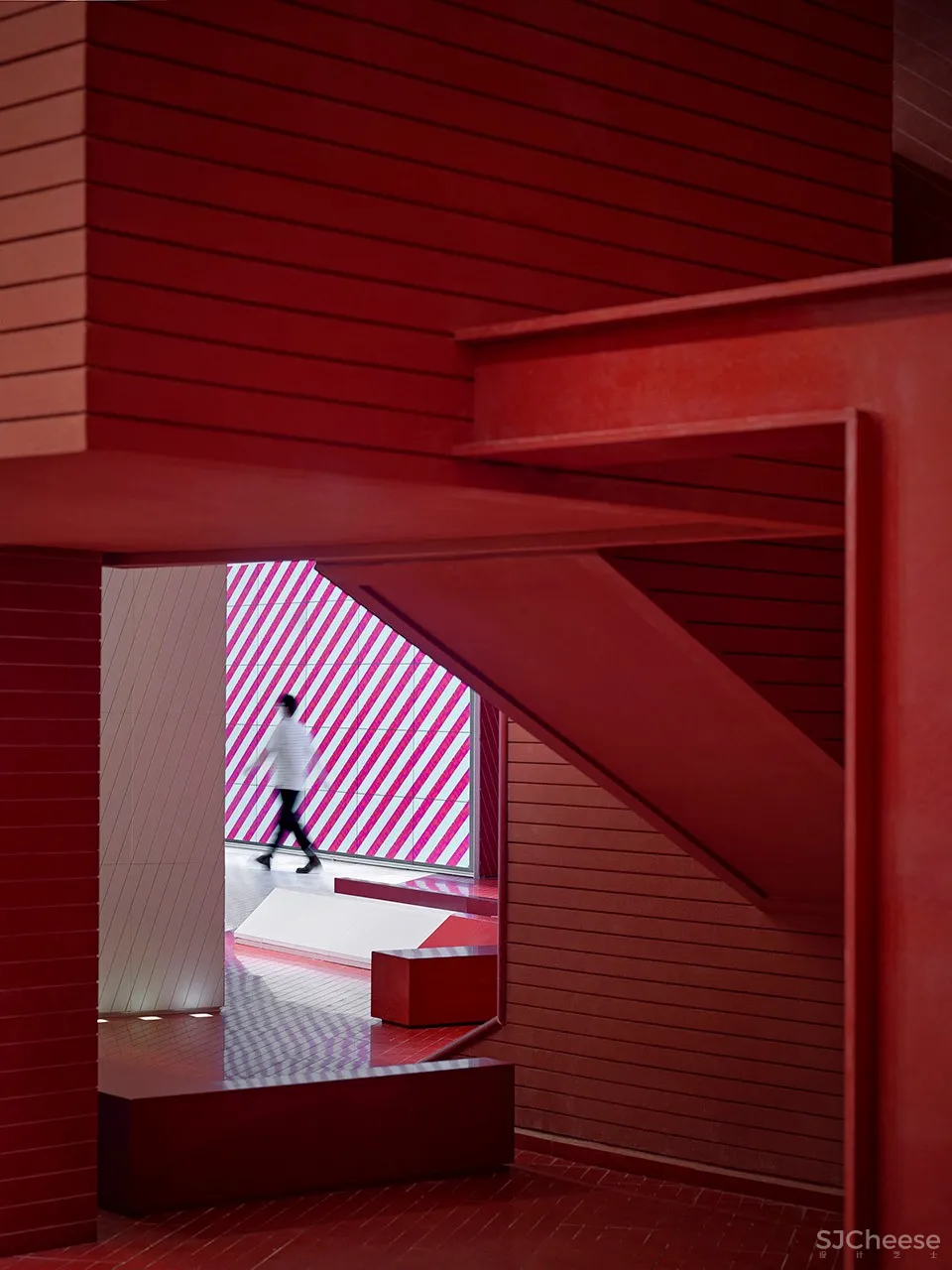
当踏进“红”的空间后,墙面和天花的红色,配合以灯光所照射出的光影 ,感觉这一步就进入截然不同的空间中来。刚才的白色空间恍如隔世一般遥远,沿着红色空间走进去影院里,会有清晰的标志指引到各影厅。
When you step into the ‘red’ space, the red color of the walls and ceiling, combined with the red light, makes you feel like you have stepped into another completely different space. The white space seems so far far away. When you walk towards the cinema along the red space, there are clear signs to guide you towards different auditoriums.
▼红色空间,red space
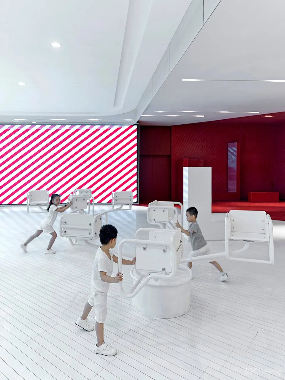
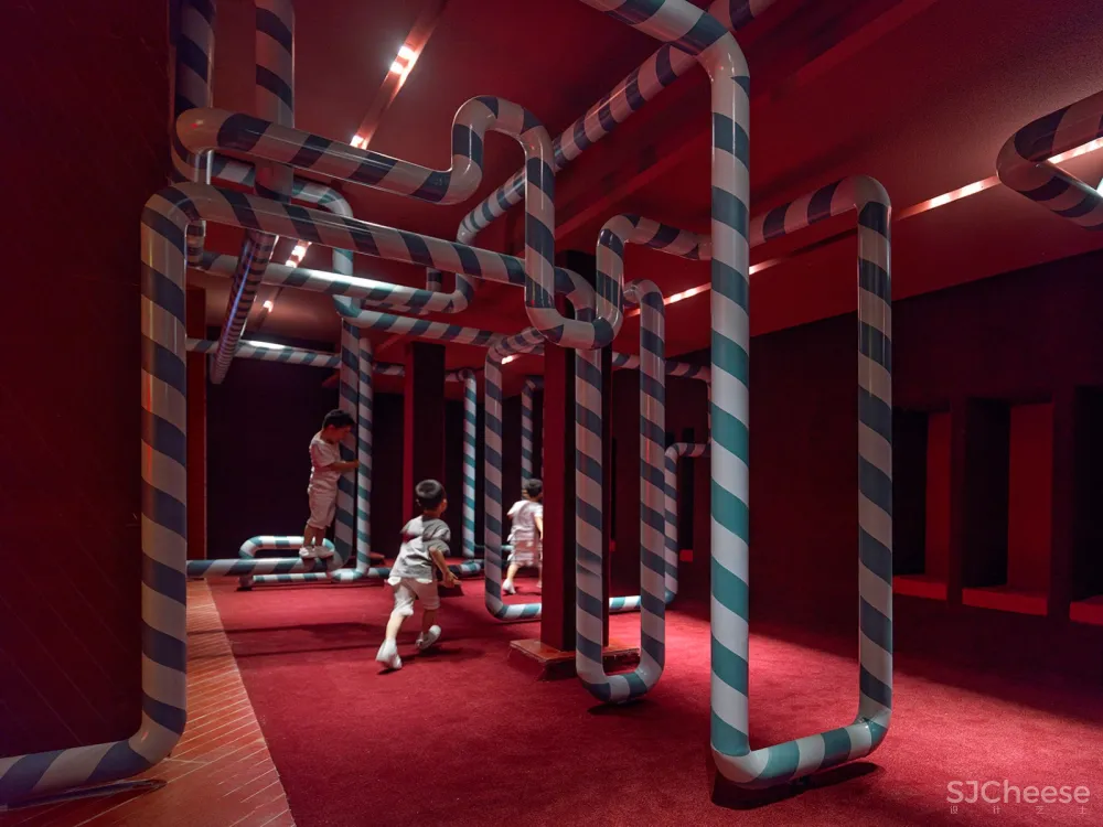
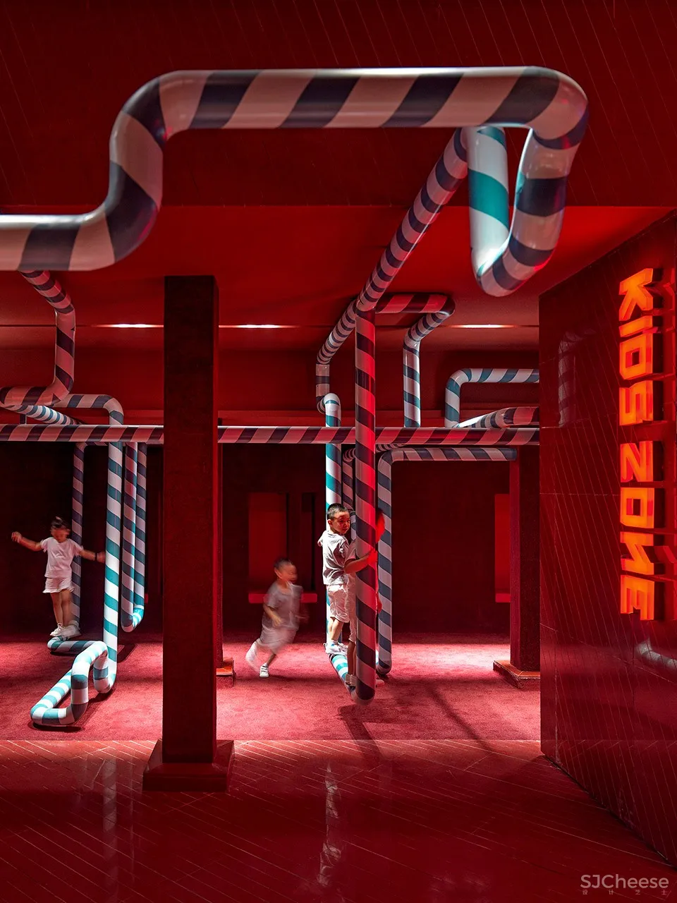
走道内,我们设计了一个儿童活动区,用圆管在空间中延伸,小朋友可以圆管上坐着,或者再圆管上攀爬游乐。增加亲子之间的互动关系。我们也适当的增加供小朋友游戏的团团转座椅。
The public areas of the hallway have also been designed as a children’s activity areas, using tubes to extend throughout the space. Children can sit on these tubes or climb along the tubes to have fun. The designers have also added extra seating arranged in a circle to increase the interaction between parents and children.
▼走道中的管道娱乐装置
tubes for children to play in the hallway
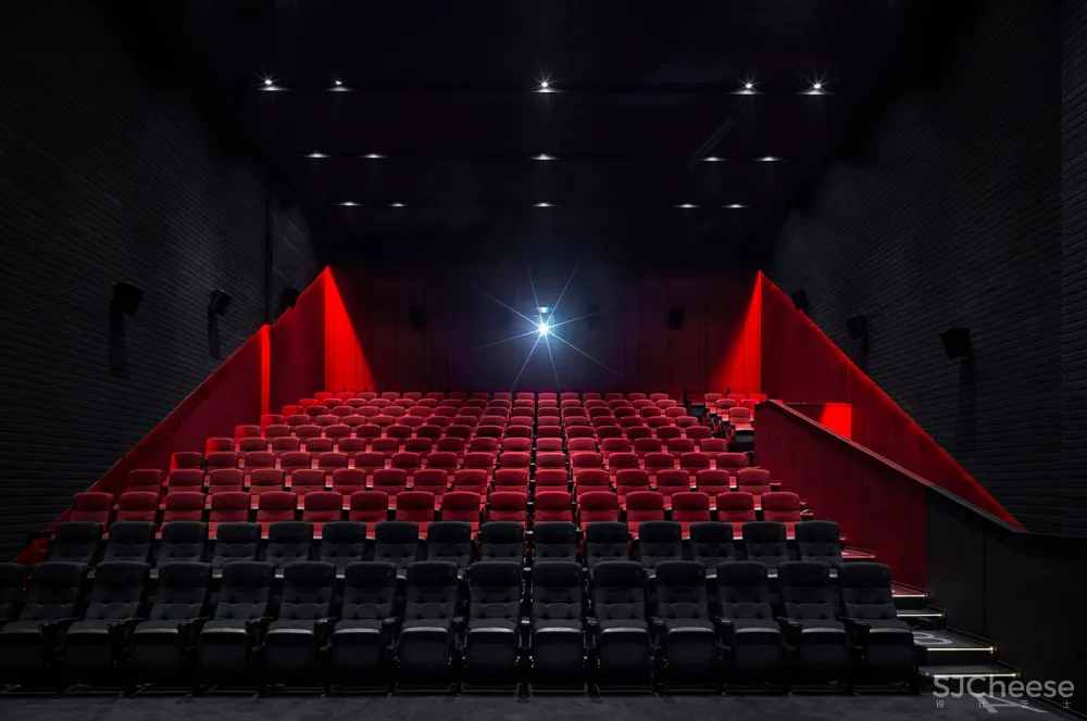
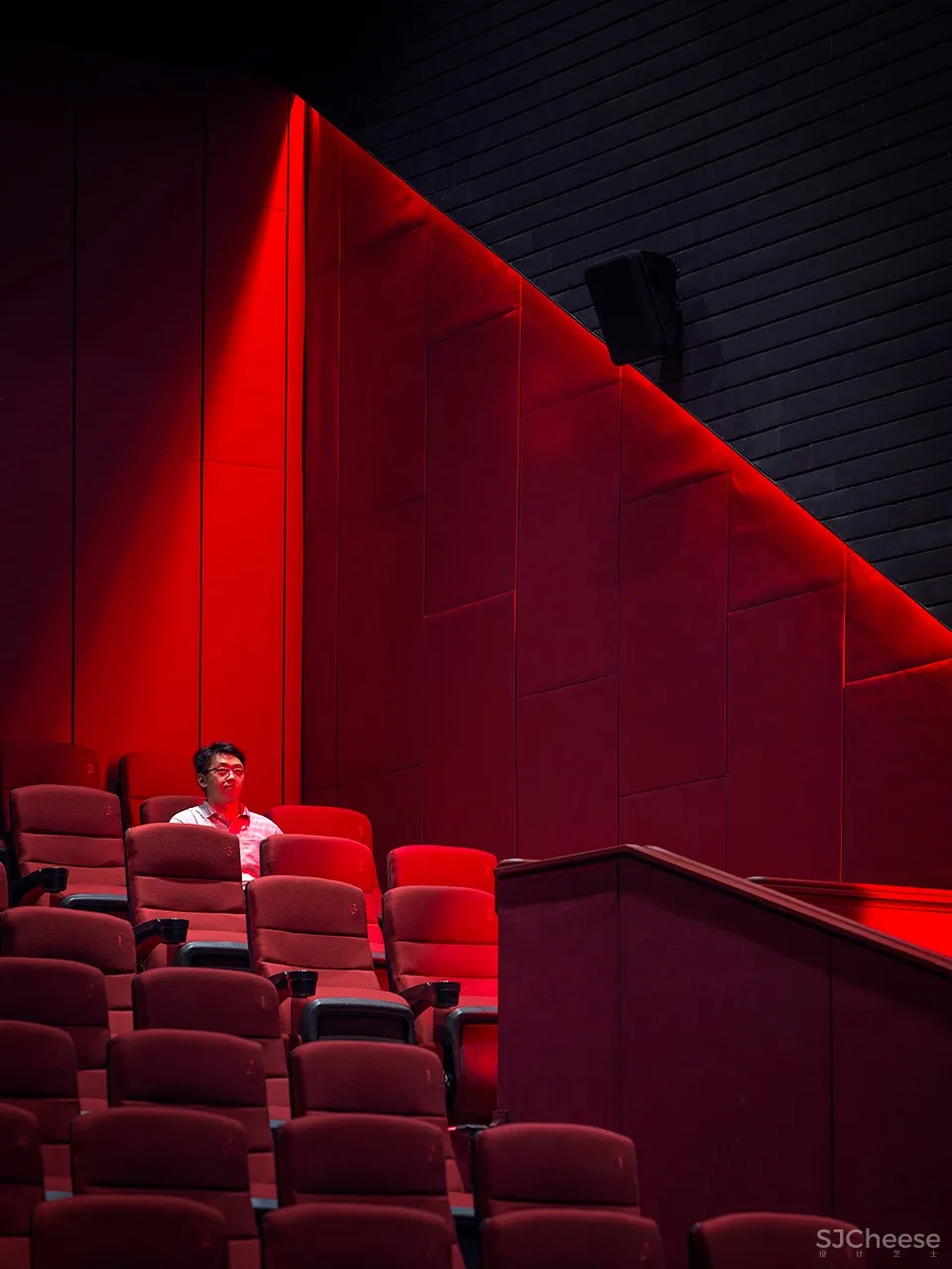
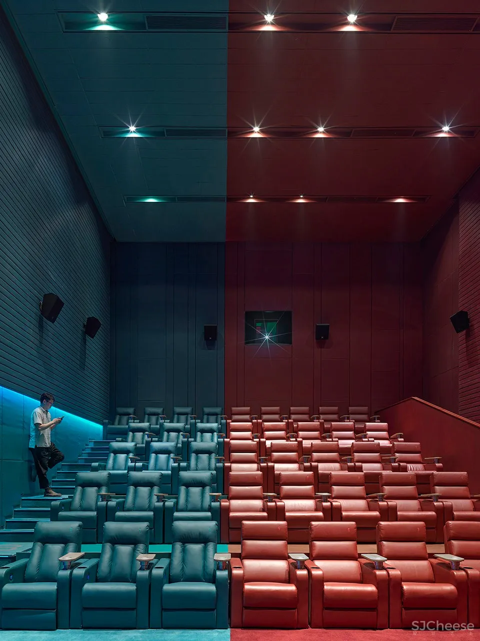
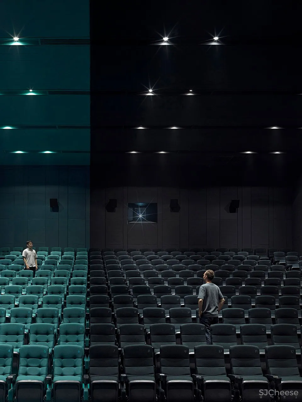
影厅之中,采用不同的两种颜色将影厅空间分割开来,两种颜色在一个空间中的冲突,泾渭分明的行成一体,一道光线将空间割裂开来。青色和红色是负片上色彩的互补色。影城内颜色的搭配也结合了“负片”的主题概念,在新项目中,尝试更多创新的颜色搭配。参考传统胶卷负片的色彩,却又突破影院常规的颜色搭配。
Walking into the auditorium with giant screen, the contrast between red and cyan gives a more shocking visual effect. It seems that the two colors collide in a space, and the distinct strokes are integrated into one, as if there is a light that separates the space from top to bottom. Cyan and red are the complementary colors of the negative film. The designers follow the theme of ‘negative film’ in the choice of color as well – in conjunction with the lighting of the ceiling wall and the color of the seat, the details of the entire space are consistent throughout the whole space.
▼影厅空间由两种颜色分割,two colors contrast in the auditorium
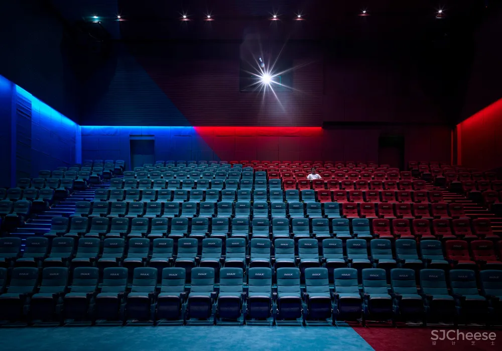
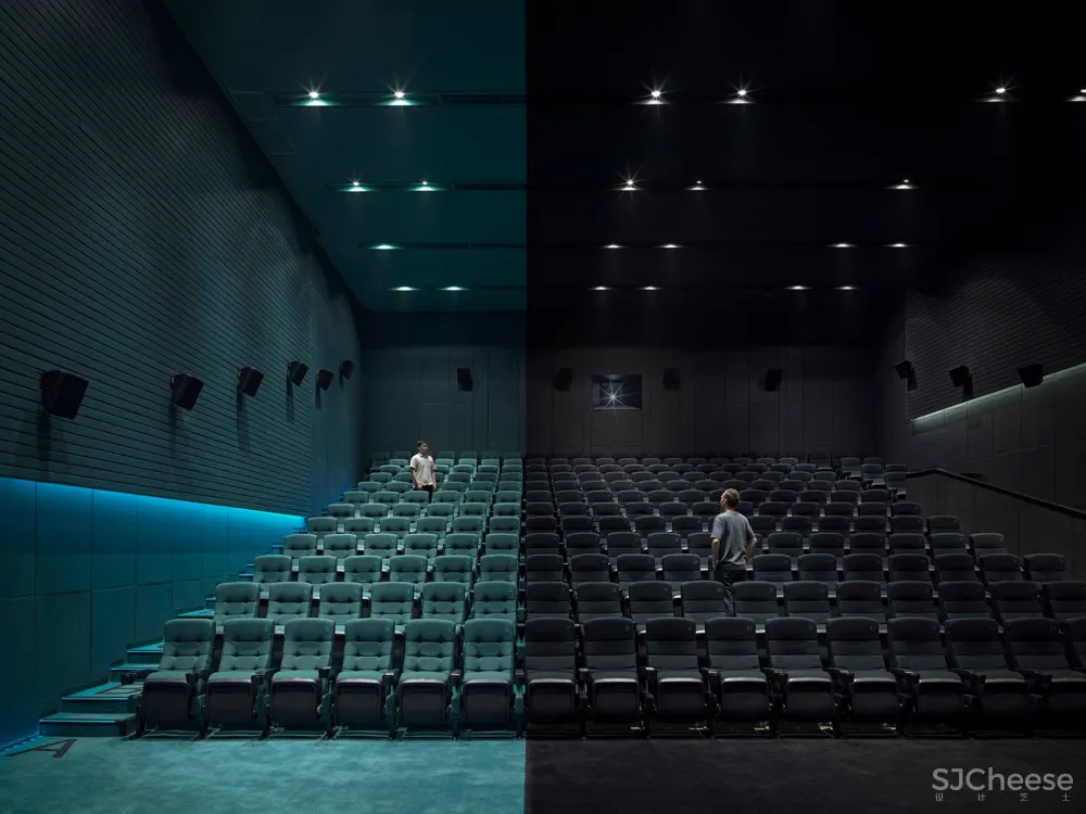
这次负片的主题设计,更多的体现在颜色的搭配上。空间上明确的分割关系,使空间变得有趣和生动,而非传统意义上的融合。这种新的和谐关系,是用更强烈的互补颜色配合灯光进行的一次全新尝试。灵感来源于传统,却又在分寸间突破传统。
The theme design of this negative film concept is being demonstrated with the use of colours matching. The clear division of the space makes the interior more interesting and vivid, rather than the ‘combination’ in the traditional sense. This new approach is designers’ new attempt to match the lights with a stronger contrast of complementary colors. This project is a good example of designers’ persistence towards design – inspired by tradition, yet breaking the boundaries in details.
▼颜色搭配形成独特的观影氛围,unique atmosphere created by contrast between colors

项目名称:长江银兴影城西安御锦城凯德广场店
设计方:壹正企划有限公司
公司网站:WWW.ONEPLUSPARTNERSHIP.COM
联系邮箱:mt@onepluspartnership.com
项目设计&完成年份:2019年7月完工
主创及设计团队:罗灵杰、龙慧祺
项目地址:陕西西安
建筑面积:4154㎡
客户:湖北长江电影集团


