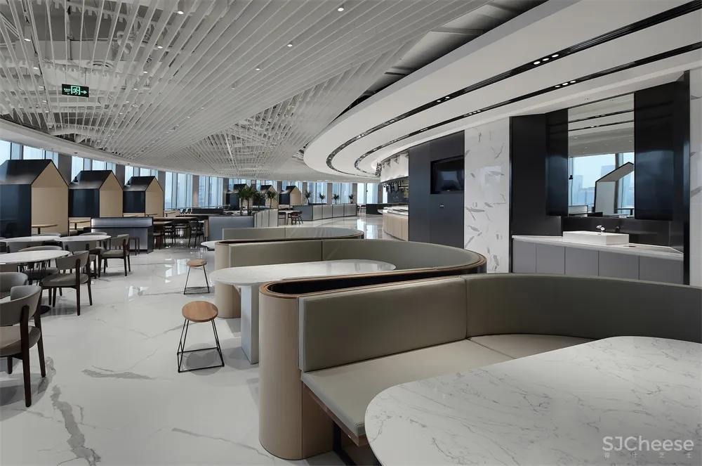
感谢来自 深圳叁上叁设计顾问有限公司 的餐饮空间项目案例分享:
“对于我来说,最好的设计在窗外,如何让空间与自然对话,让人在200米的高空听风、观海、漫步云端,是我要做的一切。” ——叁上叁创意总监:霍庆涛
“For me, the best interior design should allow the dialogue between the space and nature. What I tried to do as approaching the project was to enable people to listen to the breeze, overlook the sea and interact with clouds in the space nearly 200 meters above the ground.”
2019年,OPPO启用深圳湾的新办公区:被昵称为“春笋”的中国华润大厦。这座高392.5米的摩天大楼,坐拥360°自然与城市全景。
In 2019, OPPO launched a new office in Shenzhen Bay Area, which is situated on the 392.5-meter-high China Resources Tower (also known as “Spring Bamboo”).
∇ 餐厅入口
∇ 概念草图

员工餐厅不仅是企业的硬件形象,同时也是品牌的软实力象征。曾成功为华为和唯品会打造员工餐厅的叁上叁设计,受OPPO公司委托为其进行员工餐厅形象的全新塑造。
A staff canteen can not only present the image of the corporation, but only embody the brand’s soft power. OPPO entrusted Shenzhen Sanshangsan Design Consulting Co., Ltd., a studio once created canteens for many renowned Chinese brands such as Huawei and Vipshop, to conceive its new staff canteen.
∇ 咖啡吧


以员工的应用场景为出发点 Starting from scenes where the staff use the canteen
员工餐厅的应用场景开发一直是叁上叁的研究重点。区别于传统食堂的“无差别对待”,叁上叁在设计中更多追求“个体关怀”,从人性化角度将企业的关怀精神落实到差异化的个体上。
Sanshangsan has been attaching great importance to studying on creation of scenes where corporate employees use canteens. Traditional staff canteens usually feature undifferentiated design in the interior space. However, Sanshangsan seeks for personalized designs, and works to incorporates companies’ spirit of caring into the staff canteen.
∇ 功能区域分布图

∇ 爆炸图

通过长时间的观察和员工走访,设计师归纳了多种不同的应用场景,并给出相应的解决方案,甚至为一些特殊的应用场景设计定制了全新的桌型,精准地契合需求。
After spending a long time in observation and talking with OPPO’s employees, the designers summarized various utilization scenes of the canteen, and worked out corresponding design solutions. Moreover, they customized brand new types of tables for some special dining scenes, in order to better fit into demands.
∇ 定制橡木实木餐台
∇ 半私密就餐位

将场地的景观优势最大化 Making the best of outdoor landscapes
整个餐厅空间为无柱化设计,圆形的平面提供了360°的观景视野,可以在200米的高空远眺海、湖、公园和高尔夫球场等多重复合景观。
With a round plane, the overall space is pillar-free. Nearly 200 meters above the ground, the space boasts a panoramic view of the sea, lake, park and golf court, etc.
∇ 窗外景观


为了优化高空观景体验,设计师运用了中国古典园林中“借景”“对景”和“框景”的设计手法。在风景最佳的海景面,设计师设置了大量面窗而坐的“对景”餐位,餐桌上的美食与远处的海面融为一体。
To optimize visual experiences of the outside, the designers adopted design methods of Chinese classical gardens, including “borrowing scenery”, “opposite scenery (view in opposite place)” and “enframing scenery”. On the side that enjoys the best view towards the sea, they set various window-facing dining seats, which integrate indoor scenes with the sea in the distance.
∇对景餐位


在都市景观面设置了一些“景观框”,将标志性的都市建筑景观纳入框景,欣赏到窗外都市中最美的那个点。
In addition, on the area close to urban built landscape, some frames were arranged, so as to enframe iconic urban landscape outdoors.
∇ 就餐+办公多功能就餐区


在离窗户较远的就餐区域采用“借景”手法,通过墙上镜面,将窗外的美景反射到室内,在任何一个角度都可以欣赏到高空美景。
Moreover, in the dining zone that is relatively far away from windows, the design team skillfully utilized the approach of “borrowing scenery”. The mirrors on walls reflect and introduce impressive outdoor views, which can be appreciated by the staff at any angle.
∇ 利用镜面形成借景


人流动线的高效规划 Efficient circulation routes
提高供餐效率是员工餐厅要解决的一大功能问题。OPPO深圳湾总部约有5000名员工,而餐厅的最大容量是1145人,供餐时长是1.5个小时,即每个员工的平均就餐时长只有20分钟。鉴于下班时间点的一致性,如果排队、分流和回餐动线规划不合理,就会造成大面积的人流交叉混乱和拥堵。
Improving the efficiency of catering services is a key issue. There are about 5,000 employees in OPPO’s Shenzhen Bay headquarters, while the canteen accommodate 1,145 people at the most and provides catering services with a duration of 1.5 hours, which means the average dining time for each employee is merely 20 minutes. Since the time that the employees get off work is the same, chaos and congestion would be caused if the circulation routes for queuing up, dispersing the crowd and collecting cutlery are not planned in a reasonable manner.
∇ 空间划分及动线分析图

设计师结合场地特点,设计之初做了大量的就餐动线推演,最终确定了以一条4.5米宽内环线为主动线的规划方案,沿环线内侧分布餐线和档口,外侧分布就餐区,且对环线进行强制性分隔,使排队取餐人群同用餐人群互不干扰。
Based on site conditions, the designers carried out various trials on circulation routes, and finally decided to create a loop at the center of the space, with a diameter of 4.5 meters. Inside the loop are food stalls, while outside it are dining areas. The loop is separated and partitioned, so that the employees who are queuing for taking meals and those who are dining won’t disturb each other.
∇ 美食档口


∇ 就餐区


设计师还进行了A、B、C、D四区划分,将餐盘回收间设置在每个区域的出口处,环线的内侧,避免回餐动线和就餐动线交叉,极大提高了餐厅的运转效率。
The entire space is divided into four sections, and each has an area for collecting used cutlery at the exit, which avoids the interweaving of dining circulations and cutlery collecting circulations and hence greatly improves the efficiency of the canteen.
∇ 排队区
∇ 回餐间
∇ 洗手区
团餐业态趋势引领 Leading the trend of group catering forms
员工餐厅在餐饮行业被称为“团餐”,俗称“食堂”,是一种为固定团体提供餐饮服务的餐饮业态。叁上叁设计团队在团餐设计领域深耕多年,见证了中国企业对员工餐厅建设的日益重视。
Staff canteens belong to “group catering spaces”, which provide catering services for certain groups. Sanshangsan team has been working on the design of group catering spaces for years, and has witnessed greater importance that Chinese enterprises have been placing on staff canteens.
∇ 灵感来自海风的餐位设计


作为企业形象提升的重要一环,很多知名企业率先对员工餐厅进行改革,积极吸收社会餐饮经验,引进商业化的服务与竞争模式,并从设计到施工全都委托给专业团队。员工餐厅也完成从“食堂”到“美食广场”再到“企业餐厅”的蜕变。
Many renowned companies take the lead in reforming their staff canteens, which is regarded as an important step to enhance corporate image. They actively absorb experience within the catering industry, introduce commercial services and competition modes, and entrust design and construction to professional teams. In this way, staff canteens are increasingly becoming embodiments of corporate image and culture.
∇ 由OPPO标识演化而成的椭圆餐台 


∇ 墙面装饰画
∇ 平面图
完整项目信息
项目名称:OPPO深圳湾总部员工餐厅
项目地址:中国 深圳
设计面积:2200㎡
竣工设计:2019.9
业主单位:OPPO
设计公司:深圳叁上叁设计顾问有限公司(www.sanshangsan-design.com)
创意总监:霍庆涛
设计团队:霍庆涛 牛士伟 苏振宽 倪金伟 何秀莹 曹暖 李文强
施工公司:广东华通装饰工程股份有限公司
主要材料:瓷砖(新中源BIG+大板)、家具(欧林家具、开林家具、快来意家具、森源家具)、灯具(石客照明)
项目摄影:金啸文
Project name: OPPO’s Staff Canteen at Shenzhen Bay Headquarters
Location: Shenzhen, China
Area: 2,200 m2
Completion time: September 2019
Client: OPPO
Design firm: Shenzhen Sanshangsan Design Consulting Co., Ltd. (www.sanshangsan-design.com)
Creative Director: Huo Qingtao
Design team: Huo Qingtao, Niu Shiwei, Su Zhenkuan, Ni Jinwei, He Xiuying, Cao Nuan, Li Wenqiang
Construction firm: CHINAWAY (GUANGDONG) DECORATION CO., LTD
Main materials: ceramic tiles (Xin Zhong Yuan), furniture (ONLEAD, KALN, FINEST, SENYUAN), lamps (SIKI)
Photography: Jin Xiaowen


