Photography by WM Studio

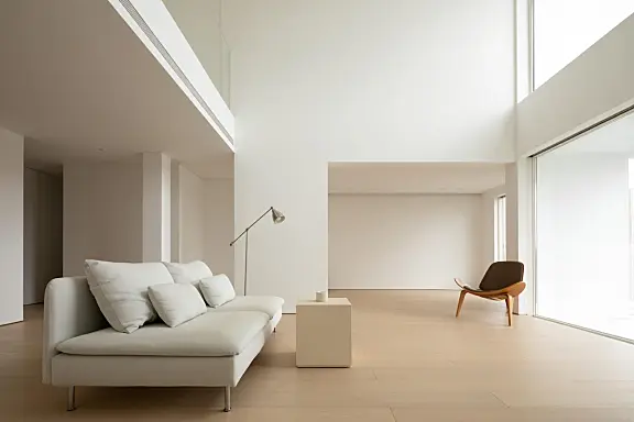
顶层复式公寓是上海Nothing Design工作室设计的最小空间。项目规划根据用户的空间偏好和生活习惯为室内提供了更多开放的选择,而不是精确定义公共区域的功能框架。其主要思想是极简开放,通过注重可塑性和功能,室内设计被推进到建筑雕塑领域。特别定制的入口门有效防止了整个开放和流动区域的突然视觉感知,它统一了入口和内部。虽然冷色调和垂直线条靠近顶部和视觉重心所在的位置,但一楼的公共区域由靠近地面和需要触摸的外墙的温暖木材制成,确保了温暖的触感,同时形成了一个硬而最小的空间。
Penthouse Duplex is a minimal space designed by Shanghai-based studio Nothing Design. The program planning gives more open alternatives for the interior in accordance with users’ spatial preferences and living habits rather than precisely defining the functional framework of the public area. The main idea is minimalist openness, and by focusing on plasticity and function, interior design is propelled into the realm of architectural sculpture. A detail that effectively prevents abrupt visual perceptions for the overall open and flowing field is the special customized entry door, which unifies the entrance and the interior. While the cold colors and vertical lines are near the top and the location where the visual center of gravity exists, the public area on the first floor is made of warm wood near the ground and the façade that needs to be touched, ensuring a warm touch while forming a hard and minimal space.


通过暴露墙来移除设计的创建的场框架,以几何坐标显示建筑基底。具有各种属性的单元位于开放、独立和相关区域,具有各种功能的模块之间具有开放流。通过以一种完全鲜明和雕塑的方式呈现墙壁,该设计有目的地颠覆了追求封闭和连接空间的传统观念,在连续和破碎的内外之间创造了独特的几何美感。该设计通过移除模块之间的屏障来暴露开放的内部结构。壁变化的矩阵状序列同时揭示了由各个轴表示的功能特征。
The created field framework of the design is removed by exposing the walls, revealing the building substrate in geometric coordinates. Units with various properties are positioned in open, independent, and related areas with open flow between modules with various functions. By presenting the walls in an utterly stark and sculptural way, the design purposefully subverts the conventional idea of pursuing closed and connected spaces, creating a singular geometric aesthetic between continuous and shattered in and out. The design exposes the open internal structure by removing the barriers between modules. The matrix-like sequence of wall changes simultaneously reveals the functional characteristics represented by the various axes.


 室内采用了和谐的比例和建筑规模,使用了墙壁结构、作为房间一部分的隐藏楼梯和家具。为了激发人们在建筑周围旅行的兴趣,一条新的迁徙路线被创建,将餐厅和厨房区域之间的墙壁作为路径。餐厅和厨房属性的发展是通过使用原始的木地板系统和家具完成的,与完全白色的墙壁和面板形成对比。天窗在引入自然光的同时增强了空间的三维性。哑光白色百叶窗提供了对光透射量的精确控制。
The interior is built with harmonic proportions and architectural scale using the wall structure, the hidden staircase that is a part of the room, and the furnishings. To stimulate interest in traveling around the building, a new migratory route is created using the wall between the dining and kitchen area as the path. The development of the dining and kitchen attributes is completed by the use of an original wood flooring system and furniture, which contrast with the walls and panels that are completely white. The skylight enhances the space’s three-dimensionality while bringing in natural light. The matte white louvers provide precise control over the amount of light transmission.


现在这个浮躁的世界,能细心整理一些东西发上来的越来越少了。要么就是敷衍的图片,要么就是枯燥的文字。之后就是AI生成的预制菜类的打包便捷快餐了。感谢楼主的分享,让我能在大智能无人化来临之前,看到同类发出的项目。有幸与您互动,缘分2
是不是一直复制,人就会变懒,变笨,第一次的复制粘贴,可能还略带羞赧,第二次再复制,内心的自责就少了一分,第三次毫不犹豫的ctrl+v 是那么的心安理得。回头一看,重复的留言已经700多条了。心安理得么?得到了什么呢?
人生本就短暂,走了除了家里三代人能记得,谁有会记得谁呢?反倒是这数字世界会多多少少留下我们的印记,然而周而复始的评论终究无法让人看上一眼,注定成为网络垃圾。
垃圾+2
昨天看到儿子在家里玩儿我的世界积木。突然发现小孩子每天都能摆出不同的造型,比之以前已经创造出很多有意思的空间设计了,除了地上建筑里刚需的客餐卧,还有地下室活动空间,储藏室,战备工具间。。。。。儿子是彩色的,而我的色彩饱和度越来越低了。
唐老师这个案子,已经是第多少次刷到都不记得了。
很棒的設計內容
施工好
设计太考验功力了,对施工要求很高?