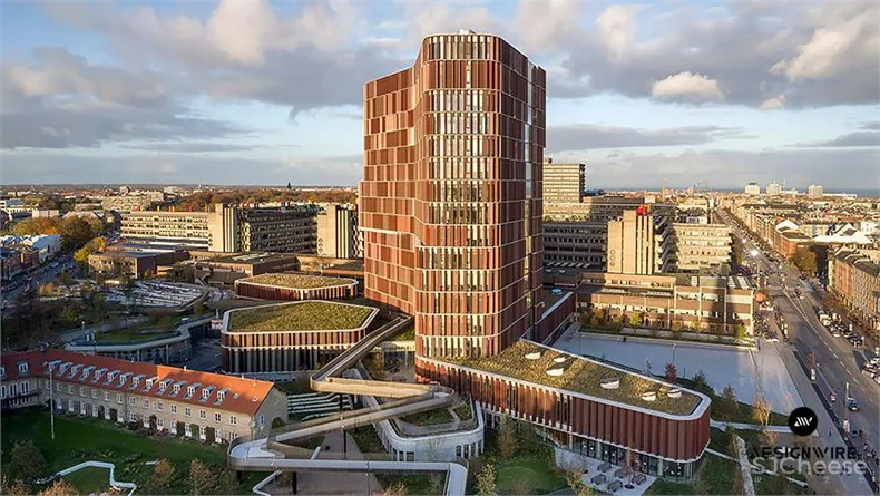
由CFMøller建筑事务所为哥本哈根大学设计的Maersk大楼是该大学的-健康与医学科学学院。这个斯堪的纳维亚团队为拥有最先进的研究设施的大楼,设计了垂直穿孔金属百叶窗环绕着该楼的弧形外墙。
Vertical perforated-metal louvres wrap around the curved facades of this towerdesigned by CF Møller Architects for the University of Copenhagen.The Scandinavian firm designed the Maersk Tower as a state-of-the-art research facility and an extension of Panum – the university’s Faculty of Health and Medical Sciences.
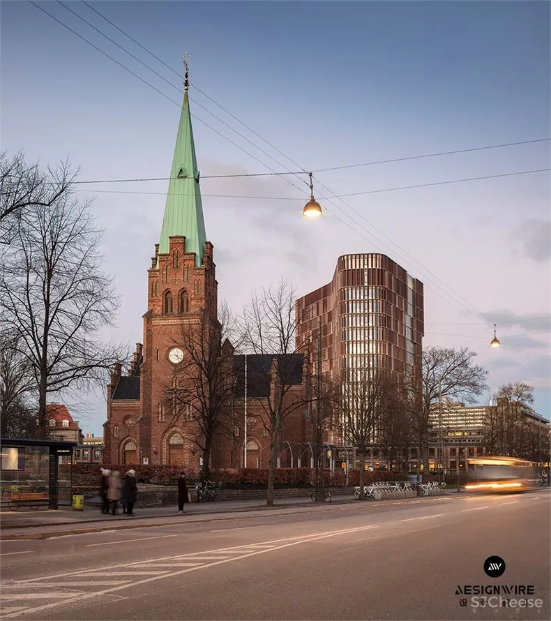
这座15层高的建筑内包括研究和教学设施,以及带礼堂和会议室的会议中心。它从一个低矮的星形基地为基准,向城市延伸,以加强学校与社区之间的联系。
The 15-storey building contains both research and teaching facilities, as well as a conference centre with auditoriums and meeting rooms. It emerges from a low, star-shaped base that reaches out towards the city to enhance the connection between the school and the community.
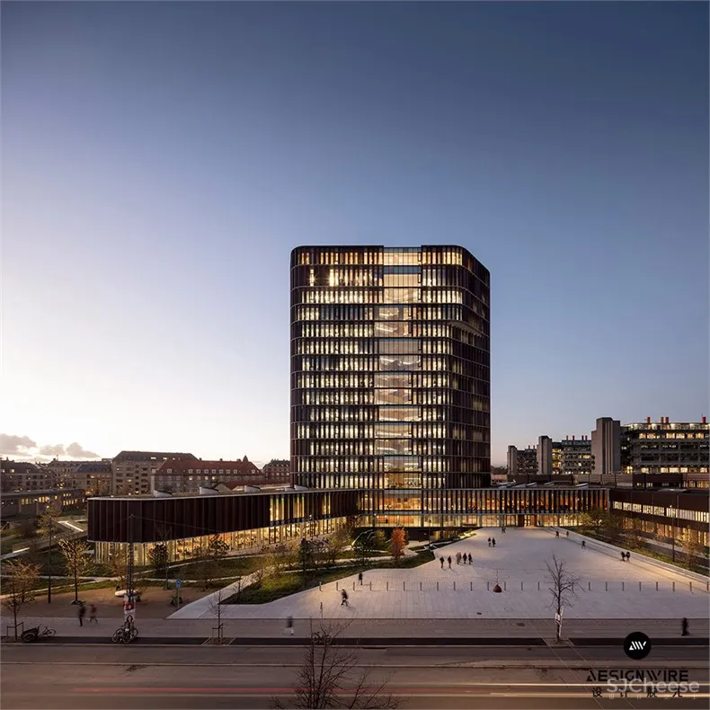
建筑工作室将塔楼独特的曲线形状描述为“标志性雕塑”,以及“城市与北校区之间的可见联系”。 其创新设计2018年入围该年Dezeen高层建筑类奖的名单,同时入选的包括Beirut(贝鲁特)现代主义风格公寓楼和首尔David Chipperfield 建筑师事务所公司总部。
The architecture studio described the tower’s distinctive curved form as a “sculptural linchpin” for the faculty and a “visible link between the city and the North Campus.”Its innovative design earned the project a place on the shortlist for 2018 Dezeen Awards in the Tall building category, alongside buildings including a Modernism-inspired apartment block in Beirut and a headquarters for a beauty company in Seoulby David Chipperfield Architects.
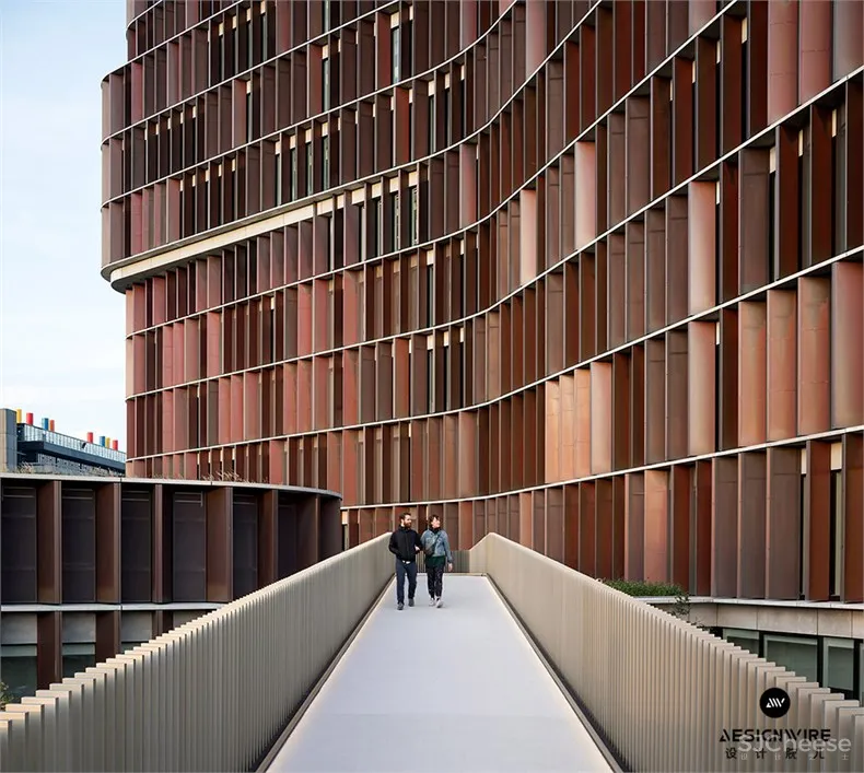
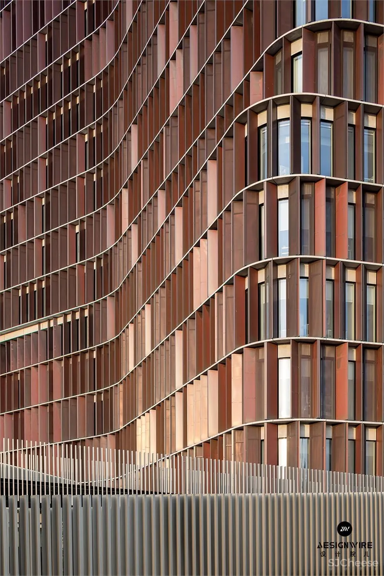
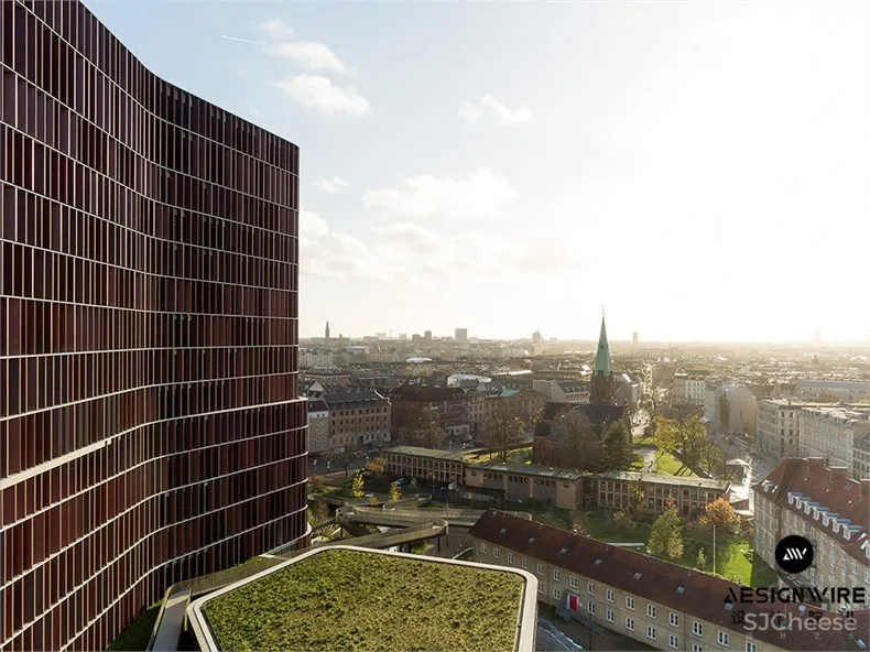
Maersk大楼的光滑和动态的玻璃幕墙由层层攀高的铜涂层百叶窗覆盖,旨在参考丹麦首都的许多铜教堂尖塔。 百叶窗在建筑物周围形成一个类似浮雕的网格,有助于保护玻璃免受阳光直射。可移动百叶窗可根据太阳的位置自动打开和关闭,而其穿孔表面可让充足的日光到达室内。
Maersk Tower’s smooth and dynamic glazed facades are covered by a grid of storey-height copper-coated shutters intended to reference the Danish capital’s many copper church steeples.The shutters create a relief-like grid around the building that help to protect the glazing from direct sunlight. The movable louvres open and close automatically in response to the sun’s position, while their perforated surfaces allow ample daylight to reach the interiors.
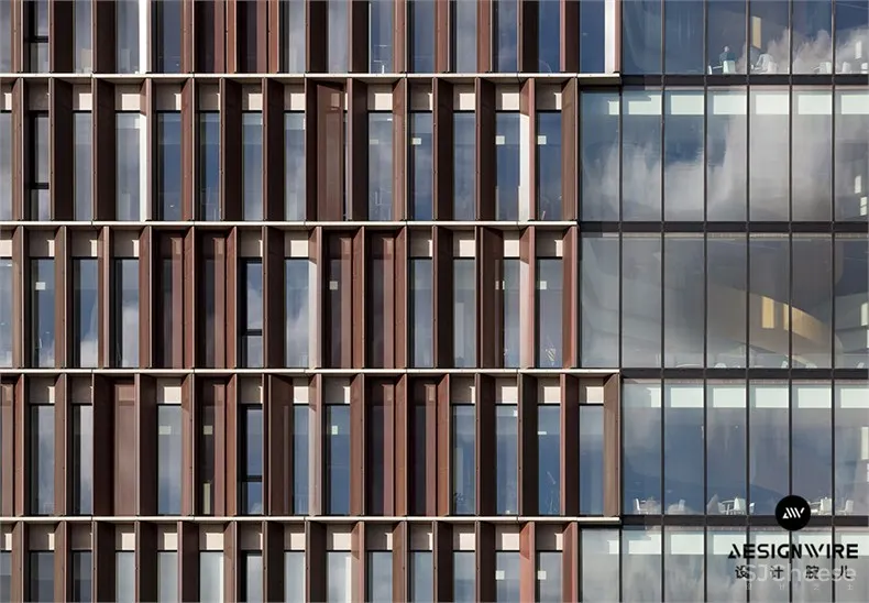
垂直面板的布置也有助于减轻结构的整体规模,并创造垂直节奏,与校园的原始设计相辅相成。
The arrangement of the vertical panels also helps to mitigate the structure’s overall scale and creates a vertical rhythm that complements the design of the original campus.
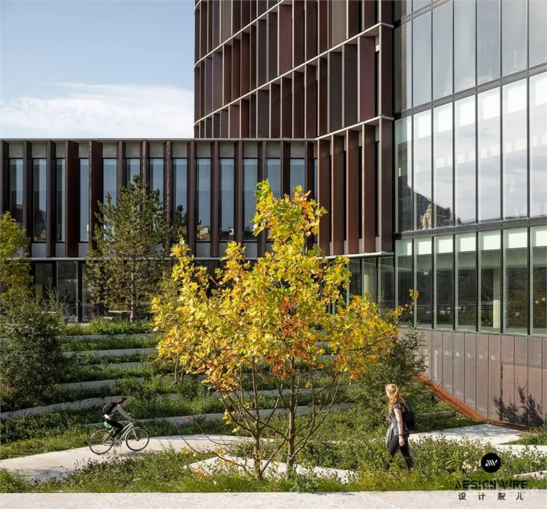
“现有的Panum综合体建于20世纪70年代,被认为是野兽派的杰作,而 Maersk大楼在颜色和立面方面看起来都很明显,”该工作室说。 “但不像现有的Panum综合体看起来内向闭塞, Maersk大楼的基地形态热情拥抱城市并邀请公众进入。”
“The existing Panum complex, built in the 1970s, is considered to be a Brutalist masterpiece, and the Maersk Tower looks to refer to it clearly both in terms of colour and facade rhythm,” the studio said.”But unlike the existing Panum complex, which appears introverted, the base of the Maersk Tower embraces the city and invites the public in.”
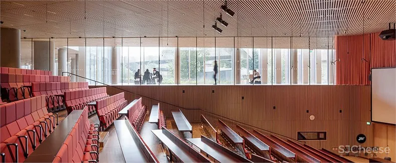
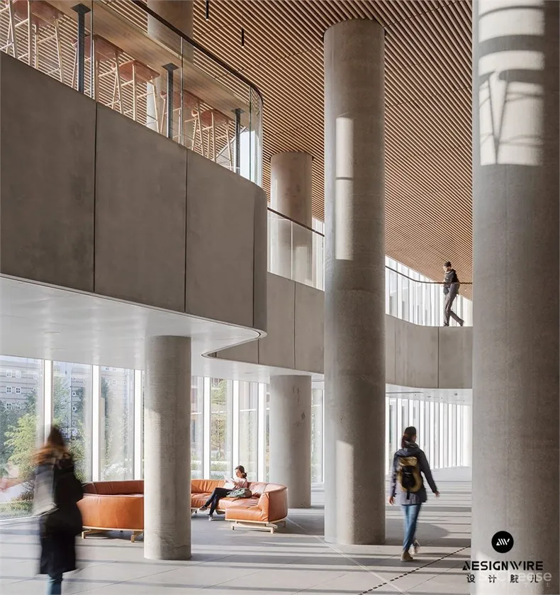
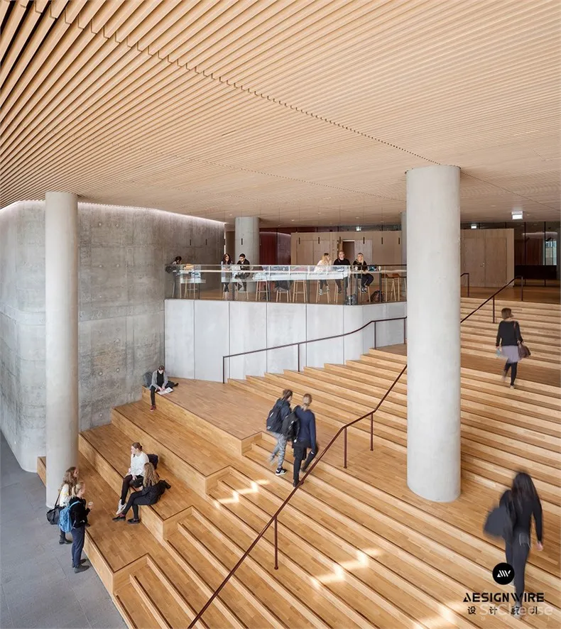
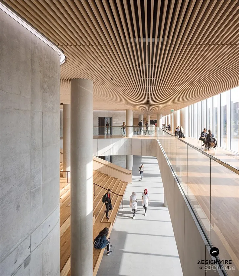
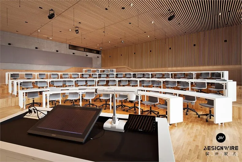
该建筑的讲台包含共用和公共设施,其中有演讲厅、教室、食堂、展示室、会议室和书籍咖啡厅。该结构的比例旨在匹配现有Panum复合体的比例。 位于此楼层的门厅旁提供了一个开放的公共区域,可以与其他学生和工作人员即兴相遇。这个空间通过一个大型木制楼梯与较高楼层相连,这些楼梯设有阶梯式座位,方便非正式聚会。
The building’s podium contains shared and public facilities, including lecture halls, classrooms, a canteen, show lab, conference rooms and a book cafe. The proportions of this structure are designed to match those of the existing Panum complex.A foyer also located on this level provides an open communal area for impromptu encounters with other students and staff. This space is connected with the upper floors by a large wooden staircase incorporating stepped seating that facilitates informal gatherings.
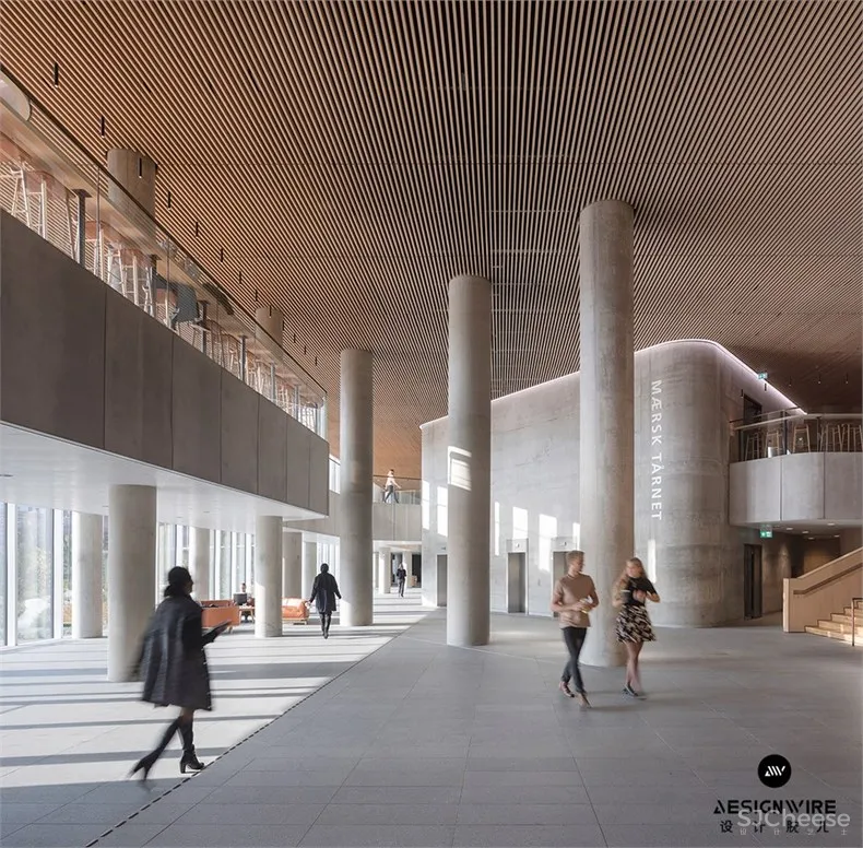
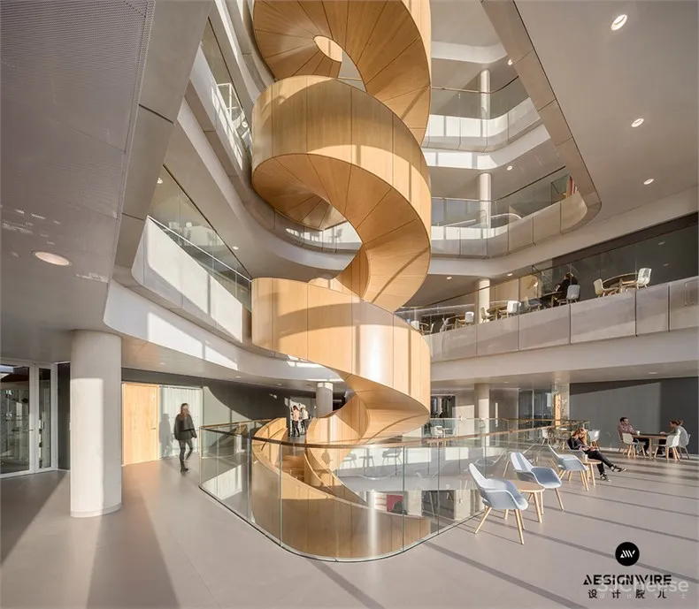
一个开放的中庭向上延伸穿过塔楼,每层都有一个连接公共区域的雕塑木楼梯。通过铜百叶窗的垂直排列,从外面可以看到楼梯。 塔楼容纳了建筑物的研究设施,这些设施被包裹在玻璃墙内,有助于保持居住者之间的视觉联系。
An open atrium that extends up through the tower houses a sculptural timber staircase connecting communal landings on each level. The staircase is visible from outside through a vertical break in the copper louvres.The tower accommodates the building’s research facilities, which are contained within glass walls to help maintain a visual connection between the occupants.
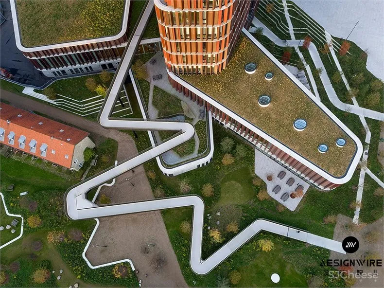
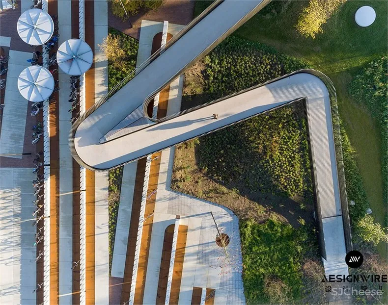
建筑底部周围是一个向所有人开放的城市校园公园,因此可以促进与当地人的紧密联系。 园景公园包含一条高架道路,使公众和建筑物的使用者都能够在两条重要道路之间穿过场地时看到内部。
Surrounding the base of the building is an urban campus park that is open to everyone and therefore promotes a stronger connection with the local area.The landscaped park incorporates an elevated path that brings both the public and the building’s users close enough to see inside as it traverses the site between two important roads.
设计团队:CFMøller
项目地点:丹麦,哥本哈根
完成时间:2018年
摄影师:Adam Moerk
本文内容来源于:设计腕儿


