感谢来自 UAO瑞拓设计 的建筑改造项目案例分享:
UAO瑞拓设计 将自己的办公地从江边搬到了一个武汉良友红坊艺术社区内的独栋小楼里;良友红坊艺术社区的前身是上世纪60年代,武汉肉联厂的配套厂区——猪鬃厂,羽毛厂,厂区内建筑均是具有生产性质的老工业建筑。UAO负责厂区的景观设计,以及最核心建筑:ADC艺术设计中心的建筑和室内设计。
UAO moved its office from the riverside to a single small building in the Liangyou Hongfang art community in Wuhan; the predecessor of the Liangyou Hongfang art community of was the supporting factory of Wuhan meat joint factory in 1960s – bristle factory and feather factory., and the buildings in the factory are old industrial buildings with production properties. UAO is responsible for the landscape design of the plant area, as well as the core architecture: the architecture and interior design of ADC art design center.
∇ ADC艺术中心(UAO负责改造设计的红坊核心建筑) ADC Art Center (the core building of Hongfang that UAO is responsible for renovation design)

延续:从规划和景观着眼的设计 Continuation: design from the perspective of planning and landscape
良友红坊艺术社区前身是武汉猪鬃厂、羽毛厂;90年代被作为建材市场使用,随着城市的发展,建材市场也日渐没落;由于使用功能的变迁,厂区内的建筑由不同年代建设,有60年代的红砖单层木桁架瓦屋面厂房,也有80年代,多层砖混结构,外表面水磨石的厂房;也有90年代外表瓷砖或小马赛克的楼;上海水石的总体规划保持了原有小楼的基本结构,外表面材质,让历史的痕迹从建筑形态的不同就能得到表现和延续;
Liangyou Hongfang art community, formerly known as Wuhan bristle factory and feather factory, was used as a building material market in the 1990s. With the development of the city, the building material market is also declining. Due to the change of the use function, the buildings in the factory are built in different years, including the red brick single-storey wood truss tile roof factory in the 1960s, and the multi-storey brick concrete structure factory in the 1980s with terrazzo on the outer surface. There are also buildings with exterior tiles or small mosaics in the 1990s; the overall planning of Shanghai Shuishi keeps the basic structure of the original small building, with exterior materials, so that historical traces can be expressed and continued from different architectural forms;
∇ 红坊全区鸟瞰图(红色为UAO新办公室)Aerial view of the whole area of Hongfang (UAO new office in red)

在设计梳理过程中,在厂区的核心区内发现有一栋内空较高的独栋小楼,位于高大的红砖烟囱和水塔旁,前身是工业厂区的发配电机房。高耸的内部空间,阳光从顶上的天窗和夹层的窗户倾泄下来,照耀着烟熏火燎过的,布满历史痕迹的老墙面,极具冲击力的空间感;UAO的创始人兼主持建筑师李涛决定将其租用下来作为自己的办公空间。
In the process of design, it is found that there is a single small building with a high void in the core area of the plant, which is located next to the tall red brick chimney and water tower. The former is the distribution motor room of the industrial plant. The towering interior space, the sun pouring down from the skylight on the top and the window on the mezzanine, is shining on the smoky and burning old wall, which is full of historical traces, with a strong sense of space; the founder and chief architect of UAO, Li Tao, decides to rent it as his own office space.
∇ 发电机房改造前外观 摄影:李涛 Appearance of generator room before reconstruction , photography: Li Tao

∇ 发电机房改造前内部空间 摄影:李涛 Internal space before reconstruction of generator room , photography: Li Tao

高耸:发扬原有空间的特质/ Towering: carry forward the characteristics of the original space
∇ 构思草图 by 李涛 Sketch by Li Tao


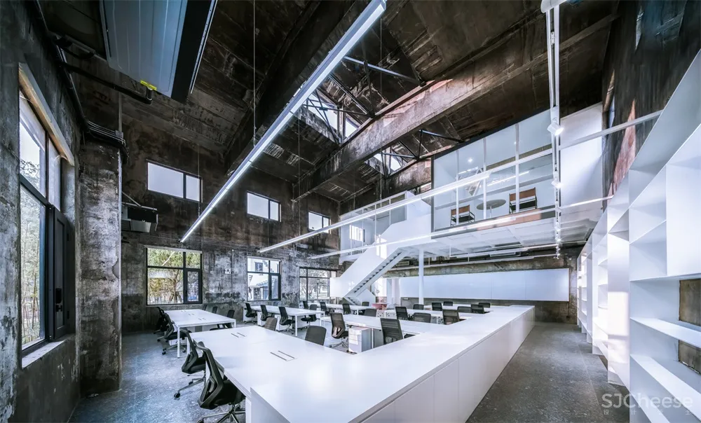
原有发电机房总高度8米,如教堂般高耸的空间很是震撼;设计的最初出发点就是保留并发扬这个高耸空间感特质,所以新设计很克制,只以较少的空间体量植入到大空间里去,最后的决策是只靠原来二层一侧新建设计一个柱跨宽度的夹层,以保留大厅大部分的竖向空间格局,让这个新的植入不仅没有改变空间原有的特征,继续让阳光倾泄下并布满整个空间;而且它的形态强化了高耸空间的特征,并给与一个观者直观的尺度衡量。
The original generator room has a total height of 8 meters, The towering space like a church is very shocking. The original starting point of the design is to retain and carry forward the high-rise space sense, so the new design is very restrained, only a small space volume is implanted into the large space, and the final decision is to rely on the original two-story side to design a new column span width mezzanine to retain most of the vertical of the hall. The spatial pattern makes this new implant not only not change the original characteristics of the space, but also let the sunlight pour out and fill the whole space; moreover, its shape strengthens the characteristics of the towering Space and gives an intuitive scale to the viewer.
∇ 保留阳光倾泄的竖向空间特质 Keeping the vertical space characteristic of sunlight

∇ 增加很少的夹层空间 Add few mezzanine space

靠一侧设计夹层的目的,也使得建筑因为天窗获得的长轴方向的序列感得以保留。
The purpose of designing the mezzanine on one side also makes the sense of sequence of the long axis obtained by the skylight retained.
∇ 长轴方向的序列感得以保留 The sense of sequence in the long axis is preserved.

夹层仅通过中间的一根200mm直径的柱子来支撑,加上折线楼梯,更加强化了夹层的重量和漂浮感,它通过建筑的表达去强化结构的独立支撑作用,类似于筱原一男的白之家中心的柱子;中心柱的轻巧反衬着周遭厚重而有历史痕迹的墙体——新的体量以纯净的白来体现,老的墙面仅清扫后刷墙面固化剂,保留了原有的烟熏火燎、甚至是脏的痕迹,从而产生一种新与旧的对话和反差。这种“脏”也是原有空间的特质和历史。
The mezzanine is only supported by a 200mm diameter column in the middle, and the folding staircase strengthens the weight and floating sense of the mezzanine. It strengthens the independent supporting function of the structure through the expression of the building, similar to the column in the center of Xiaoyuan’s White House. The light and ingenious central column contrasts with the thick and historic wall around – the new volume is reflected by pure white. , the old wall is only painted with curing agent after cleaning, which keeps the original trace of smoke, fire and even dirt, thus creating a new dialogue and contrast with the old. This kind of “dirty” is also the characteristics and history of the original space.
∇ 一根柱子支撑其夹层的结构 A structure in which a column supports its interlayer.

白色的体量延申至钢板书架、柜子和桌子,大厅内再通过家具辅以少量的红色来点缀;
The white volume extends to steel bookshelves, cabinets and tables, and the hall is decorated with a small amount of red furniture.
功能:服务与被服务空间 Function: service and served space
在决定了夹层的形式和位置,同时对UAO的使用功能进行了梳理。
结合UAO多年来的工作流程和模式,我们对办公室的功能分为三大部分:办公+配套服务+展览论坛。办公包含两位合伙人的办公室和办公大厅;配套服务包括:模型室、打印室、会议室和财务室,以及茶水间和卫生间,而展览论坛需要的是一个干净整洁的大空间;
根据这个功能要求和目前建筑的现状,将高区高耸空间作为办公区域,将南边较低的低区作为配套服务空间,将高耸空间东侧本来就是两层的空间,一层给前厅和展览,二层给会议和论坛,二层的会议室外,就是配套服务空间的屋顶,它形成了一个天台空间,也成为做室外论坛交流的绝佳位置。
In determining the form and location of the mezzanine, at the same time, the use function of UAO is combed.
Combined with UAO’s working process and mode over the years, our office functions are divided into three parts: Office + supporting services + exhibition forum. The office includes two partners’ offices and office halls; supporting services include: model room, printing room, meeting room and finance room, as well as tearoom and restroom, while exhibition forum needs a clean and tidy large space;
According to the functional requirements and the current situation of the building, the high-rise area is taken as the office area, the lower area in the south is taken as the supporting service space, and the east side of the high-rise space is originally a two-story space, the first floor is for the front hall and exhibition, the second floor is for the conference and forum, and the second floor is the roof of the supporting service space, which forms a rooftop space. It’s a great place for outdoor forum communication.
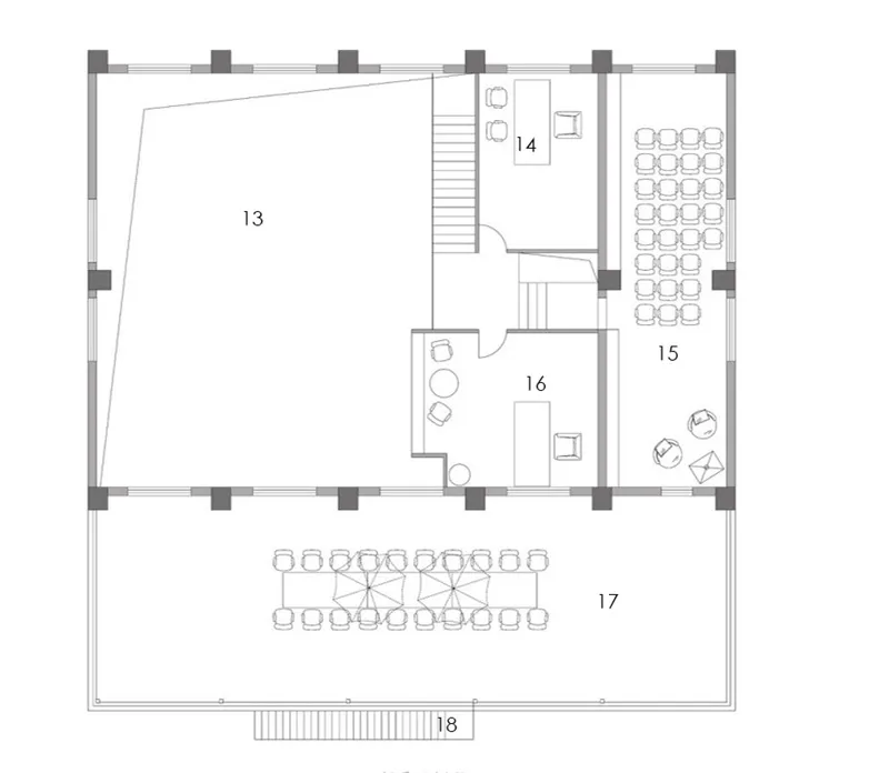
∇ 平面图 Plan


平面图序号索引:Plan No. index:
1 前厅/展厅 2 讨论 3 办公大厅 4 框景窗 5 走廊 6 茶水间 7 储藏 8 财务室 9 卫生间
10 模型切割/打印 11 模型制作/讨论 12 花园 13 上空 14 办公室 15 会议室 16 办公室 17 天台
18 消防楼梯
1 front hall / exhibition hall 2 discussion area 3 office hall 4 frame view windows 5 corridor 6 tea room 7 storage 8 finance room 9 restroom
10 model cutting / printing 11 model making / discussion 12 garden 13 Over the hall 14 office 15 meeting room 16 office 17 terrace 18 fire stairs
功能关系上,高空间的办公大厅和低高度的配套空间,构成了路易斯康所说的被服务与服务空间;设计在材质和色调上刻意做了区分,服务空间(包含茶水间、卫生间、模型室、打印室、会议室等)采用了黑色调,配以红色的数字和房间的局部彩色,如卫生间隔间内的橙黄色、墨绿色;茶水间里的花砖;模型室内的黄色洞洞板挂板;而被服务空间(即办公大厅和前厅会议室等,则是以纯白为主色调的理性控制的空间调性);服务空间采用色温3000K的暖白光,而被服务空间则采用色温4000K的白光;
In terms of functional relationship, the office hall with high space and the supporting space with low height constitute the service space and service space described by Louis Kahn. The design deliberately distinguishes between the materials and colors. The service space (including tea room, rest room, model room, printing room, meeting room, etc.) adopts black tone, with red numbers and local color of the room, such as rest room cubicle Orange and dark green inside; tiles in the tea room; yellow hole board hanging board in the model room; and the space to be served (i.e. the office hall and the meeting room in the front hall, etc., are the space tonality rationally controlled with pure white as the main color); the service space adopts warm white light with color temperature of 3000K, while the space to be served adopts white light with color temperature of 4000K;
∇ 服务空间与被服务空间 service and served space

服务空间偏向感性,被服务空间偏向理性;服务空间饱满的色彩和较暗的空间,更加烘托出被服务空间纯白,高耸和向上的神性。
The service space is inclined to sensibility, and the service space is inclined to rationality; the full color and dark space of the service space more foil the pure white, towering and upward divinity of the service space.
隐喻:平面和剖面完美结合的设计 Metaphor: the perfect combination of plane and section design
建筑设计,经常首先从平面布局入手,但这个项目的高耸空间特质,使得我们的设计在第一时间就考虑从剖面入手:在高耸空间内设置夹层,夹层的高度比原有二层要低900MM,其目的是在高耸空间内形成完美的比例关系;在底层配套服务区域,将茶水间和模型室楼上设置夹层休息室和模型材料间,但是放弃了卫生间、会议室楼上的夹层设置,目的是保留空间的高低节奏,为不同空间满足不同的观感和感受,比如会议讨论空间较高的设置,也方便各种讨论和碰撞。
In architectural design, we usually start with the plane layout first, but the high-rise space characteristic of this project makes our design consider starting from the section at the first time: set the mezzanine in the high-rise space, the height of the mezzanine is 900mm lower than the original two floors, its purpose is to form a perfect proportion relationship in the high-rise space; in the supporting service area of the ground floor, the tea room and the model room building The mezzanine rest room and model material room are set on the upper floor, but the mezzanine setting on the rest room and meeting room is abandoned, so as to keep the high and low rhythm of the space and meet different views and feelings for different spaces, such as the higher setting of meeting discussion space, which is also convenient for various discussions and collisions.
∇ 剖透视图 Section&Perspective view

建筑师在画剖面图的时候,会将剖到的墙体等建筑主体部分涂成灰色淡显的填充;因而在夹层右侧突出来的盒子的四周,也将其四周围合的方框截面,刷成了灰色油漆,它的目的其实隐喻了这里像图纸中一样被剖切了一刀,如同建筑师在蓝图剖面图中要表达的那样。
When the architect draws the sectional drawing, he will paint the main part of the building such as the cut-out wall into gray light filling; therefore, around the box protruding from the right side of the mezzanine, he will also paint the surrounding box section into gray paint. Its purpose actually metaphors that here, like in the drawing, is cut, as the architect wants to express in the blueprint sectional drawing.
∇ 切开的剖面隐喻 Sectional metaphor of incision

流动:空间蒙太奇 Flow: space Montage
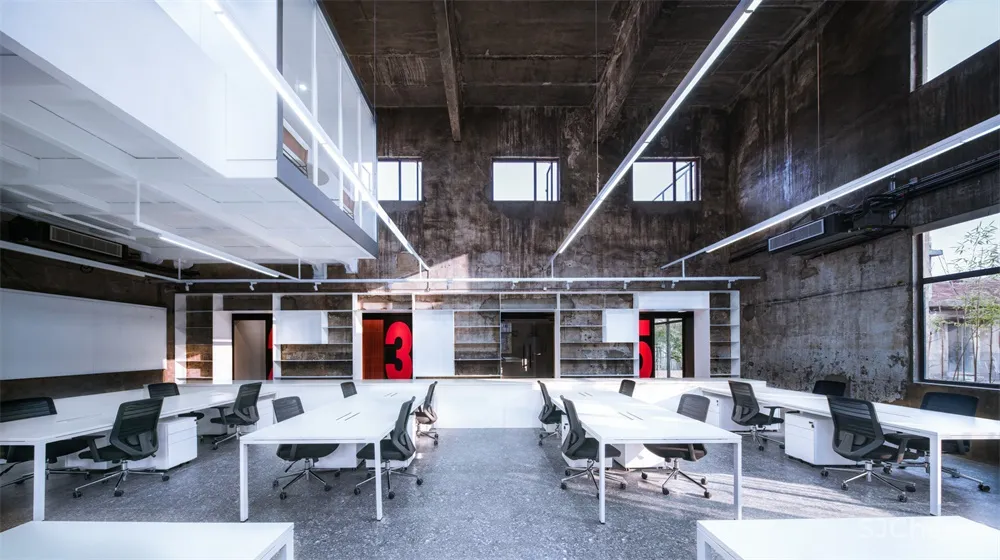
原建筑的低区和高区之间的墙体本来只有两个门,高区厚重的南墙将高区和低区分割成两个视线并不相通的部分;设计对应二层平台窗户的位置,在高区一层打开了三个窗洞,它形成了服务空间与被服务空间之间的互动;同时因为钢板书架的设置,使得墙体从视觉假象上变得很厚,它让两侧的空间虽然视觉上是连续的,但是从一个空间过度到另一个空间,犹如在电影切换镜头时的加黑遮挡的处理,加上两侧空间色温和黑白色彩的对比,更加强化了“剪辑”式的镜头处理。
There were only two doors in the wall between the low area and the high area of the original building. The thick south wall in the high area divided the high area and the low area into two parts which are not connected by the line of sight. The design corresponds to the position of the platform window on the second floor, and three window holes are opened on the first floor of the high area, which forms the interaction between the service space and the served space. At the same time, because of the setting of the steel bookshelf, the wall can be seen from the vision. The illusion becomes very thick, which makes the space on both sides continuous visually, but the transition from one space to another is like the processing of adding black cover when the film switches the lens, and the contrast of color temperature and black-and-white color on both sides, which further strengthens the “clip” lens processing.
∇ 框景 Framed scenery

同时所开的三个新的窗洞,成为空间的取景框;也形成了服务空间与被服务空间的联动,整个空间因此而流动起来。
The three new window openings become the view frame of the space, and also form the linkage between the service space and the served space, so the whole space flows.
∇ 空间蒙太奇 space Montage

并置:新与旧的物理间隙 Juxtaposition: new and old physical gap
新的植入和旧的保留,自然形成了新老元素的并置,以期达到把建筑的三维空间加上时间这一维度的目的,这也是并置手法的最终目的。在新的钢板和旧的墙体之间,其刻意保留的物理间隙(没有填缝砂浆,没有收口收边),将钢板材料的挺括和墙体材料的自然剥落形成对比,这个间隙提醒着新与旧之间的物理距离和时间距离。
New implantation and old reservation naturally form the juxtaposition of new and old elements, so as to achieve the purpose of adding the three-dimensional space of the building with the dimension of time, which is also the ultimate purpose of juxtaposition. Between the new steel plate and the old wall, the intentionally reserved physical gap (no caulking mortar, no closing edge) contrasts the straightness of the steel plate material with the natural peeling of the wall material, which reminds the physical distance and time distance between the new and the old.
∇ 新旧之间的物理间隙 new and old physical gap

新的夹层,二层办公室的盒子的故意凸出,使得它与老墙之间也离开了一定距离。
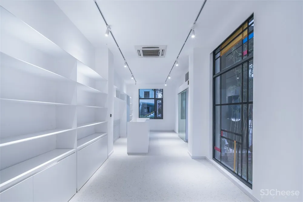
书架全部使用8MM厚钢板,它的薄,也与原有墙面的厚重感形成了对比。
The new mezzanine and the intentionally protruding box of the second floor office make it away from the old wall. All bookshelves are made of 8mm thick steel plate. Its thickness is also in contrast with the original wall thickness.
∇ 前厅:薄钢板制作的书架 Front hall: bookshelf made of sheet steel

∇ 办公室:薄钢板的展示架 Office: display rack of sheet steel

∇ 盒子的植入 Box implantation


波普:服务空间走廊的数字游戏 Pop: the digital game of service space corridor
服务空间走廊的12345数字,用钢板焊接刷成红色,它跳出了走廊较暗的环境,使得在大厅里穿过窗洞看向走廊的时候有了景深。它也赋予办公室不一样的温暖性质,和流行的“性冷淡风”拉开了距离,也给予生活化的场景体验;
The number 12345 of service space corridor is painted red with steel plate welding. It jumps out of the dark environment of the corridor, making it have a depth of field when looking through the window hole in the hall to the corridor. It also gives the office different warm nature, and the popular “Normcore” opened the distance, but also gives the living scene experience;
∇ 数字走廊的波普表达 Pop expression of numbers corridor

由于墙体的遮挡关系,在大厅的任何一个角度,都看不到全部的数字,只能看到局部三个数字的组合。这些数字也顺利成为了配套空间的房间指示系统,1号对应茶水间,2号对应财务室,3号对应卫生间,4号对应模型室,5号对应会议室。很方便的指引外来的访客到需要的房间,
Due to the shielding relationship of the wall, at any angle of the hall, we can not see all the numbers, only the combination of local three numbers. These numbers have also successfully become the room indication system of the supporting space. No. 1 corresponds to the tea room, No. 2 corresponds to the finance room, No. 3 corresponds to the rest room, No. 4 corresponds to the model room, and No. 5 corresponds to the conference room. It is very convenient to guide visitors to the rooms they need.
∇ 不能看全的数字 Can not see all the numbers.

外观:克制的外观和由内部流线所决定的外部设计 Appearance: restrained appearance and external design determined by internal streamline
老发电机房的造型,是典型的工业建筑的风格,追求简洁明了,满足功能所需,其高大天窗的设计也是为了满足快速排烟排热的需求;在本次改造设计中,设计师克制住自己,没有对外观进行过多的改动,只替换了门窗;
The modeling of the old generator room is a typical industrial building style, which pursues simplicity and clarity to meet the functional requirements. The design of its tall skylight is also to meet the needs of rapid smoke exhaust and heat removal. In this reconstruction design, the designer restrained himself, did not make too many changes to the appearance, only replaced the doors and windows.
∇ 改造基本保持了发电机房外观的原貌 The transformation basically keeps the original appearance of the generator room

但将原有的北向大门封成落地玻璃窗,将主入口修改在东侧的山墙,这样改动的原因是从平面布局流线而来:大厅作为主要办公场所,需要一个相对封闭的环境;而前台设计在东侧较低矮的一侧;大门的设计也采用钢结构,黑色柱子是内部夹层结构支撑柱用剩下的半根柱子。
The original north facing gate is sealed as a ground glass window, and the main entrance is modified in the East gable. The reason for the change is from the plane layout streamline: the hall, as the main office space, needs a relatively closed environment; the front desk is designed on the lower side of the East; the gate is also designed with steel structure, and the black column is the rest of the supporting column of the internal sandwich structure.
∇ 门口的钢柱是室内钢柱用完剩下的余料 The steel column at the door is the rest of the indoor steel column.

场景:工作与生活并置的理念 Scene: the idea of juxtaposition of work and life
一个办公室,绝不仅是单一工作的场景,工作和生活密不可分。这也是这次设计的一大出发点:在低区的屋顶平台,布置成了BBQ的天台,也是专业论坛分享的绝佳场地;在小院内,布置了鱼池,从茶水间可以直接出到小院;所有的场景围绕工作和生活共同展开。
An office is not just a single work scene, work and life are inseparable. This is also a big starting point of this design: the roof platform in the low area is arranged as the roof platform of BBQ area, which is also an excellent place for professional forum to share; in the small courtyard, a fish pond is arranged, which can be directly out of the tea room to the small courtyard; all scenes are unfolded around work and life.
∇ 卫生间炽烈的色彩 The fiery color of the restroom

∇ 满人的状态 Full of staff

结语:更新和再生 Conclusion: revolution and regeneration
这个老建筑的改造,同时又是UAO的自己的办公室设计,它采取了一种内部植入的更新模式,没有破坏原有建筑的外观和主体结构,新的植入体又强化了原有建筑的空间特质,它将原有破旧的老发电机房,更新改造成UAO的办公室,是建筑的功能再生,也是UAO的一次设计再生。
The renovation of the old building is also the UAO’s own office design. It adopts a renewal mode of internal implantation, which does not damage the appearance and main structure of the original building. The new implant strengthens the spatial characteristics of the original building. It renovates the old old generator room into the UAO’s office, which is the functional regeneration of the building and UAO design.
∇ UAO 新办公室外观 烟囱下的老发电机房 摄影:赵奕龙 UAO new office appearance old generator room under chimney Photography: Zhao Yilong

完整项目信息
项目名称:UAO POWER OFFICE –UAO瑞拓设计新办公室改造设计
建筑师事务所:UAO瑞拓设计
事务所网站:WWW.UAO-DESIGN.COM
联络邮箱:[email protected]
公司所在地:湖北武汉市 汉口江岸区 良友红坊艺术社区 A7
–
项目完成年份:2019
建筑面积:474平米
项目地址:湖北武汉市 汉口江岸区 良友红坊艺术社区 A7
主创建筑师:李涛
主创建筑师邮箱:[email protected]
视觉信息
摄影师:赵奕龙
摄影师邮箱:[email protected]
项目参与者
设计团队:UAO瑞拓设计
主创设计师:李涛
团队:张杰铭、孔繁一、龙可成、陆洲、王纤惠、童亭、李莉霞
委托方:UAO瑞拓设计
结构设计:UAO瑞拓设计
景观设计:UAO瑞拓设计
施工方:UAO瑞拓设计


